You are using an out of date browser. It may not display this or other websites correctly.
You should upgrade or use an alternative browser.
You should upgrade or use an alternative browser.
The OcUK NEW Stylish themes thread 2017
- Thread starter wiiija
- Start date
More options
Thread starter's postsSoldato
- Joined
- 16 Jan 2003
- Posts
- 10,813
- Location
- Nottingham
With the latest version of the XEN theme Safari on Mac OS isn't themed properly, and I can't seem to fix it. The Stylish Extension on Mac OS hasn't been updated since 2011 and I can't seem to find anything newer, kind of annoying.
Soldato
- Joined
- 16 Jan 2003
- Posts
- 10,813
- Location
- Nottingham
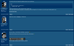
It's mostly broken completely, you can see it's attempting to apply but failing. It was working fine last week, but can't get it to apply now.
http://i.imgur.com/RYhDnm2.png
http://i.imgur.com/RYhDnm2.png
With the latest version of the XEN theme Safari on Mac OS isn't themed properly, and I can't seem to fix it. The Stylish Extension on Mac OS hasn't been updated since 2011 and I can't seem to find anything newer, kind of annoying.
Works fine here

MacOS v10.12.3
Safari v10.0.3
Stylish v1.9.6
Tried removing both the extension and the style, and starting again?
Soldato
- Joined
- 12 Feb 2006
- Posts
- 17,412
- Location
- Surrey
Shoot. Ok i will try have a play again at some point
Does look much better mortals I agree 
That's easily fixed Nexus18, I just need to find a post like it and I'll have a tinker.
Edit test: Fixed it with a margin but it's not ideal really, it's possible to simply remove it....which I'm sure you'll be up for Nexus18 lol
I can also float it left hmm

That's easily fixed Nexus18, I just need to find a post like it and I'll have a tinker.
Edit test: Fixed it with a margin but it's not ideal really, it's possible to simply remove it....which I'm sure you'll be up for Nexus18 lol
I can also float it left hmm
Last edited:
Soldato
- Joined
- 16 Jan 2003
- Posts
- 10,813
- Location
- Nottingham
Works fine here
MacOS v10.12.3
Safari v10.0.3
Stylish v1.9.6
Tried removing both the extension and the style, and starting again?
I have tried removing both, no idea why it's not working.
Soldato
- Joined
- 12 Feb 2006
- Posts
- 17,412
- Location
- Surrey
Does look much better mortals I agree
That's easily fixed Nexus18, I just need to find a post like it and I'll have a tinker.
Edit test: Fixed it with a margin but it's not ideal really, it's possible to simply remove it....which I'm sure you'll be up for Nexus18 lol
I can also float it left hmm
Maybe try use position relative to move it up as the whole section was moved down that way so there is a gap now, where as margin will increase the gap. I believe any way
https://userstyles.org/styles/139087/ocuk-forum-compact

Default colors with a focus on reducing wasted screen space and a few other things like the poorly placed post date. Although a fair few of the fixes seem to have been integrated in the last few days! Going to need to a bit more to it now xD

Default colors with a focus on reducing wasted screen space and a few other things like the poorly placed post date. Although a fair few of the fixes seem to have been integrated in the last few days! Going to need to a bit more to it now xD
Last edited:
Soldato
- Joined
- 16 Jan 2003
- Posts
- 10,813
- Location
- Nottingham
Managed to fix my problem, there's a setting in Stylish called 'Minify CSS before injecting' with that disabled it all works properly. It was enabled by default.
Glad you got it sortedManaged to fix my problem, there's a setting in Stylish called 'Minify CSS before injecting' with that disabled it all works properly. It was enabled by default.

Suspended
- Joined
- 17 Oct 2011
- Posts
- 5,707
- Location
- Buckingamshire
I love the Xen theme, very nice and well done!


