Is it much cheaper to get someone to design you a logo for a £230 card than pay someone to do it professionally?

Serious question? Yes. £230 is nothing in terms of corporate branding for a company the size and reputation of OcUK.
That said I admire Spie's faith in the community to produce something. There are quite a few talented people here, some professionals some not. So whose to say that a pro isnt having a go anyway..
And if people want a professional opinion about some of the entries then here goes:
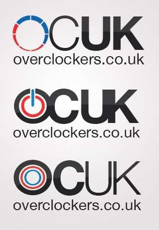
Raikiri
This was one of the first to be put up, but designed prior to the competition so I will let it off. Its an effective modern approach to the current logo. Nothing more, nothing less. Instantly recognisable as OcUK from short and long distance. Multiple versions for different applications wouldnt be significantly different.
Nimz
Another take on the current logo. Although this doesnt work quite as well. It is bad that the best bit is the text below. The logo is too busy for my liking.
Some interesting new ideas emerging, but I feel that moving away from "OcUK" as a tag for the company is a bad thing. OcUK is known quite well and it wouldnt be wise to lose it from the logo.
I like these, especially the fourth one. It works well in print applications. Although in an effort to vitalise the colours the quality has been reduced.
martian_aphid (concept) / Gurdas (refinement)
This is the best entry out of the whole "you stole mine" part of the thread. Its fresh and new but still recognisable. Im liking the reflection again (which shouldnt be a print issue tbh). The only problem with it is who owns what.. not something I would like to get involved in.
darkxenon
First of the power symbol concept, which I like. Its nice and simple but doesnt evoke OcUK to me.
Nimzicki
What are you doing?! Focus! More effort. C-. See me. But seriously, the power symbol showing up again, I definitely think its a workable concept, I just dont think the application has been perfected yet.
G-Man2004
A professional logo and it looks really smart, but the OcUK isnt clear enough for my liking.
Heofz
I like the idea (original placing of the UK), but the font is poor. It looks bloated unnecessarily. I think some refinement to this would be a definite contender.
You are working for the money arnt you. Another good design, but I am worried about the editability for OcUK and the applications from a 3d modelling program for logo design. My only critique is that from afar the O looks like an alloy wheel because of the flag shape inside.
L33
A great design, but, the font is wrong. It needs to be heavier, not too much. A good contender.
That'll do for now.


")