lol, quite the contrary, I was more referring to your womanly psychological skills... introducing yourself as a professional working in a graphics studio, discussing the company branding and so forth, being extra modest saying you're not expecting to win etc, hinting at improving the main web design and even changing the theme, using attractive female model tshirts in a dominantly male forum, posting lots of examples of brand use on random items, using a large number of aesthetically pleasing photoshops to enhance the appeal of your logo, even appealing to spie's enthusiasm for sports cars, maintaining a general but a tiny bit OTT "I love overclockers" attitude, subtley hinting in another "spec me a rig" thread that you don't need to include a graphics card because you'll possibly win this competition... all legitimate things to do, but they are all tiny subtle little things that help your cause, forming a very cunning overall tactic, and your strategy was so well executed and natural that you could simply deny everything, which is definitely what I would do.
Fair play to you though, you have most of the people here convinced (*cough* skippi

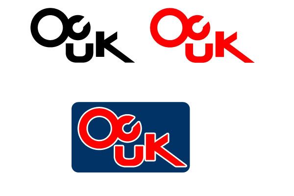
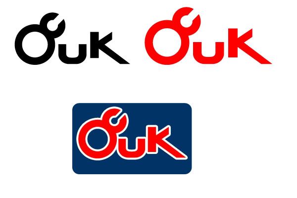
), your logo is easy on the eyes and you have sold it to most people here very well
")


")