Man of Honour
- Joined
- 5 Jun 2003
- Posts
- 92,028
- Location
- Falling...
I wonder if you can help me... I'm having a blonde moment today (I blame the stag do last weekend, and weeks of getting to work for 7am... long days) and the fact I'm not used to Office 2010 yet.
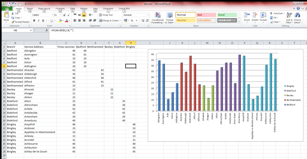
I've got the follow data:
Column1 Column2 Colum3
Site Name Count
I've plotted the name vs count (column2 along the x axis and column3 along the y axis). That's fine.
However, I cannot for the life of me remember how to add column1 so that it colour codes each bar of the chart. I want to identify on the bar chart/legend different colours for different column1 data but use the column2 data vs column3.
So basically I want column2 vs column3 to remain as it is, but just colour code using column1 the bar chart...
Does that make any sense?
Help