You are using an out of date browser. It may not display this or other websites correctly.
You should upgrade or use an alternative browser.
You should upgrade or use an alternative browser.
HTC "DLX" - 5" 1080p screen, 1.5GHz Quadcore Krait, Adreno320 GPU
- Thread starter Monkey Puzzle
- Start date
More options
Thread starter's postsYes most of HTC power buttons are on top, it's just about doable on the HTC One X but with this being taller one handed unlocking may be a tad more difficult.
You'd need a custom kernel with sweep2wake to enable swiping across the capacitive buttons to unlock. Or a kernel/rom which allows wake up using volume buttons.
You'd need a custom kernel with sweep2wake to enable swiping across the capacitive buttons to unlock. Or a kernel/rom which allows wake up using volume buttons.
Soldato
soo... any idea when this is out?
full gsmarena review: http://www.gsmarena.com/htc_droid_dna-review-853.php
no proper screen analysis - shame.
no proper screen analysis - shame.
Soldato
Looks like December 6th the release will be announced - I'm actually really looking forward to this phone since the N4 has not lived up to my expectations.
Maybe not coming to Europe?
Hmm.. Not sure whether this means that the phone is not coming in any format or its simply a name change.
Hmm.. Not sure whether this means that the phone is not coming in any format or its simply a name change.
Soldato
Maybe not coming to Europe?
Hmm.. Not sure whether this means that the phone is not coming in any format or its simply a name change.
I really hope that's not true

Soldato
That had better just be a name change!!! and the Deluxe isn't coming to europe under that moniker is what the german guy meant - could be a mis translation but there's no original german text to translate!
I don't believe that. There is no reason to coming Europe, I hope they will give us real information about global version.
I'm really addicted this phone design and also Full HD screen.
In my country, we're waiting this phone too, here is my topic;
http://forum.donanimhaber.com/m_68170470/tm.htm
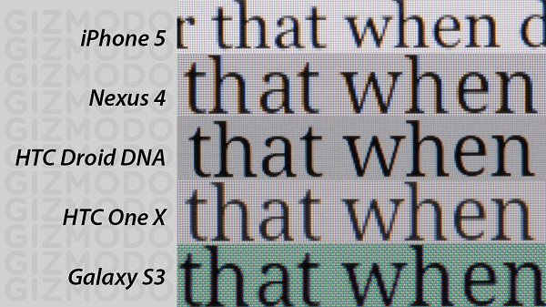
Screen test;

Here is some video tests;
Samsung Galaxy Note 2 1080p Sample Video
www.youtube.com/watch?v=jyjemgOvCfE
hTC One X+(Plus) 1080p Sample Video
www.youtube.com/watch?v=DcLSCROLPC0
hTC One X(Old one) 1080p Sample Video (my video)
www.youtube.com/watch?v=eh1I1gXdbYc
hTC Droid DNA 1080p Sample Video
www.youtube.com/watch?v=84HRV2hAmdk
I believe they will give us more information on December 6th. We'll see..
I'm really addicted this phone design and also Full HD screen.
In my country, we're waiting this phone too, here is my topic;
http://forum.donanimhaber.com/m_68170470/tm.htm
Screen test;

Here is some video tests;
Samsung Galaxy Note 2 1080p Sample Video
www.youtube.com/watch?v=jyjemgOvCfE
hTC One X+(Plus) 1080p Sample Video
www.youtube.com/watch?v=DcLSCROLPC0
hTC One X(Old one) 1080p Sample Video (my video)
www.youtube.com/watch?v=eh1I1gXdbYc
hTC Droid DNA 1080p Sample Video
www.youtube.com/watch?v=84HRV2hAmdk
I believe they will give us more information on December 6th. We'll see..
Last edited:
HTC M7 to be their next MEGAPHONE - http://androidandme.com/2012/12/smartphones-2/a-closer-look-at-the-rumored-htc-m7/
Associate
- Joined
- 5 Nov 2012
- Posts
- 405
HTC M7 to be their next MEGAPHONE - http://androidandme.com/2012/12/smartphones-2/a-closer-look-at-the-rumored-htc-m7/
not getting burned by htc again. my next phone will idealy be a nexus or a samsung one.
Can't wait for the international version to come out here.Phone looks epic all round (not as nice looking as the X and s though), doesn't look much bigger than the gs 3 either so it should be fine for one handed use as it also looks more ergonomic than the s and X.
HTC M7 to be their next MEGAPHONE - http://androidandme.com/2012/12/smartphones-2/a-closer-look-at-the-rumored-htc-m7/
Looks interesting, lets hope they get it right first time rather than getting a htc M7 + a few months after the first one comes to market.
Watching this one with interest though

Soldato
Am really hoping this will be the EU version of the DLX - am holding onto my DHD for now waiting to hear / see more about this - if it's the same screen and main specs then I'm sold - just needs at least 32gb storage or sd card slot and nice big battery (or a removable one) ...
Wasn't there supposed to be some kind of HTC announcement today (6th Dec)?
Wasn't there supposed to be some kind of HTC announcement today (6th Dec)?
From reading the user opinions over on xda, the battery life sounds great, as good as the one s/xl and gs3, if not better (some people are getting up to 6 hours on screen time). Not as good as the note 2.
There is more to battery life than just how big a battery is. It would be great if they did include a bigger battery but Tbh, going by what users have said so far, it isn't really needed imo.
There is more to battery life than just how big a battery is. It would be great if they did include a bigger battery but Tbh, going by what users have said so far, it isn't really needed imo.
Last edited:
Another phone with no sd slot so complete no buy for me i know some don't care but i prefer to be able to put an sd card into my phone and run my movies and suchlike off that saving the inbuilt for apps. Really don't get this obsession with cloud over sd but then again i am just a user not a designer so what do i know lol.
Samsung would be onto a real winner (for me) if they just:
- loose the hard home button and go with all capacitive like the one S/X or on screen buttons
- use an aluminium body or nicer looking plastic like the X, which also feels nicer to touch (they can use great materials or/and finish them to a high standard as we have seen from their windows phones)
- design a nicer looking mobile, the GS 3 corners are too curvy, the note II corners are much better, the camera/flash/speaker area on the GS 3 looks crap (IMO), again as we have seen from the windows mobiles, they are capable of designing very sleek looking devices
- complete overhaul of touchwiz, loose the cartoonish/toy colour scheme, organise their apps and give the apps/UI a unified feel throughout like sense/stock android. Much like what Motorola have done, I actually think Motorola's skin is near enough perfect now, feature rich (not as much as sense or touchwiz though) with a stock android look throughout (I wish all OEM's would include an option to be able to use their skin theme or stock ICS/JB theme)
icon and text comparison:

Last edited:


