Never Combine is something I never thought about until someone here and on reddit mentioned it, and I saw it was an option in StartIsBack too so turned it on and I really like it. Like how the icon stack dynamically expands as new windows open making nice use of otherwise wastes taskbar width space. And seeing titles of opened apps/windows in the bar too.
I have enabled all task tray icons too, mentioned how to do it earlier in the thread. Windows has the option still to show all like on Windows 10, just tick that and any icons that do happen to overflow just drag them out of overflow and from then on those apps will always be in the main tray too.
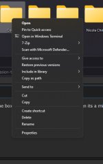
Slow down mister. It's not about the look., it's about form vs function. The current right click menu is not fit for purpose from a high usage point of view.
There are many good things about 11, but also many bad things. The
slower to respond right click menu is one of those bad things. When this improves (there is no registry edit to change this) I will switch back.... But until then I much prefer an instant right click menu and not have to wait for the noticeable delay for it to appear as it's pretty obvious for someone who uses context menus a lot for managing files between drives etc.
Video showing what I mean:
https://drive.google.com/file/d/14qIfwh0ofBJ9GZkmcjg9wriRNkNmPVX8/view?usp=sharing
Things like this might not be noticed by some as these things don't even register to the average person, but they are still annoying to many and is very evident just casually browsing Windows subreddits and other forums and even this thread.


 It's got to be 4 or less.
 .
.
