

You are using an out of date browser. It may not display this or other websites correctly.
You should upgrade or use an alternative browser.
You should upgrade or use an alternative browser.
New logo design...
- Thread starter wez130
- Start date
More options
Thread starter's postsThat's pretty much how I got the basis of the one I did... picked a randomly generated one, tweaked the styling a little bit with the shape, added the glass & fork on the top and the text in a generic image editor and jobs done.There are many AI based logo designing platforms in which you just need to add you brand name and you will get a logo in no time")
Associate
- Joined
- 1 Dec 2017
- Posts
- 303
You can paypal me your payment.
Soldato
- Joined
- 7 Apr 2009
- Posts
- 7,321
- Location
- Western Seaboard
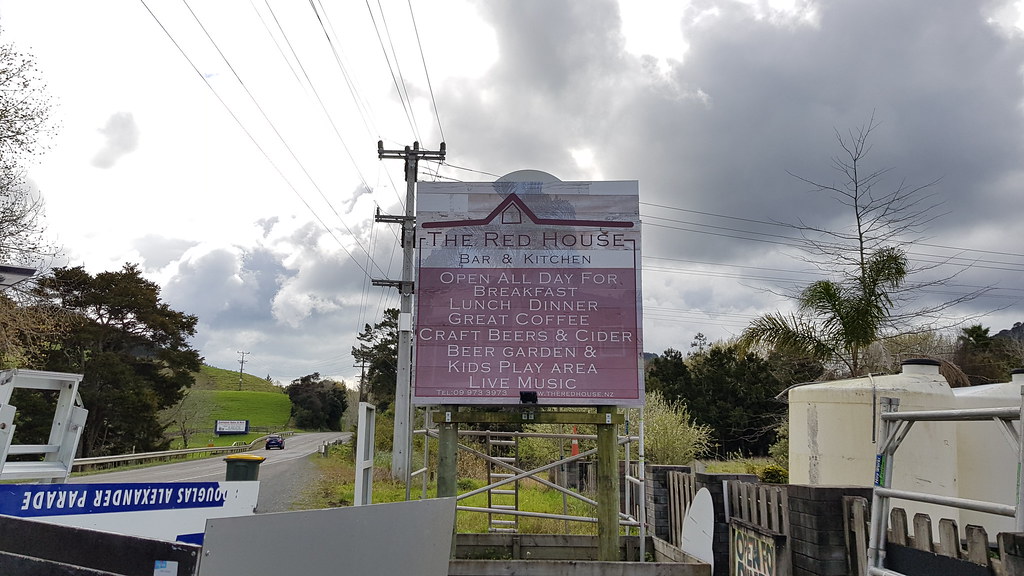
Restaurant is called 'The Red House'. That's all the info you get, as well as a pic of the current sign...
I've used Fiverr.com before for logo design. Paid 5 dollars to a chap in Bangladesh (I think) for two logo concepts and one round of rework/comments. The files were delivered as .png's if I remember correctly. For around 20 dollars they'll deliver vector graphics.
https://www.fiverr.com/search/gigs?utf8=✓&source=guest-homepage&locale=en&search_in=everywhere&query=logo design&search-autocomplete-original-term=&search-autocomplete-original-term=logo design
You can't really go wrong paying someone with talent and skills to make a logo for a fiver.
Last edited:
Just don't use a clip art cartoon cow like what a local "stakehouse" (ex working men's club) near me did.
I'm surprised they get any diners in at all.
If people don't even notice that they've spelled "steakhouse" wrong, I doubt they'll notice the crap logo either.
Soldato
- Joined
- 22 Feb 2008
- Posts
- 11,114
Does your current brand imagery carry over to the menus on the tables and whatnot?
Honestly, what you need is a clearer sign. It's less about the logo than it is the message.
First: Where do people who eat and/or drink in the place come from? Are you primarily picking up folks who are randomly driving past, or are you near a residential catchment and so have regulars who know you and live nearby?
There's too much text packed onto that sign. Dial it in to cater for the core needs you want it to catch. That's going to be high quality food and craft drinks, and potentially the family-friendly atmosphere.
Put the rest on ground signage at the car park or on the front approach.
What exactly your sign says depends on a combination of common catchment reasons and core needs, so you need to answer the question above and then succinctly combine them. Large type, easy to see at speed from a fair enough distance. Probably red sign with white type rather than the inverse.
Associate
- Joined
- 23 Oct 2013
- Posts
- 1,270
surely something simple that just says food and drink would suffice? get them off the street and then have a menu/list in the carpark.
also, white signs discolour and look unclean quickly, so avoid (probably more my personal opinion tho)
I'm not a designer, but something simple like this is better?

just thinking the red will catch car headlamps?
also, white signs discolour and look unclean quickly, so avoid (probably more my personal opinion tho)
I'm not a designer, but something simple like this is better?
just thinking the red will catch car headlamps?
Deleted member 68110
Deleted member 68110
Can I just say, I think you're making a mistake here, and it might be symptomatic of a bigger mistake.Restaurant is called 'The Red House'. That's all the info you get, as well as a pic of the current sign...
IMO a logo and a style should be "holistic", and all in keeping.
A decent corporate law firm logo is going to very different to a good folk music band's logo.
If your logo or your style is out of keeping with your food offer, your building, your surroundings etc it just won't sit right.
I think you should provide more detail about your business, and this might get better responses.
Can't stop thinking about this one.
I think you should provide more detail about your business, and this might get better responses.
Plenty of detail in his main thread
https://forums.overclockers.co.uk/threads/our-first-business-venture-the-red-house.18826636/
Plenty of detail in his main thread
https://forums.overclockers.co.uk/threads/our-first-business-venture-the-red-house.18826636/
Thanks @Armageus. Was just going to do this.
We're attracting a lot of locals (which is a good thing), and a lot of British Expats too. We do get comments on the sign being hard to read / easily missed hence the need to change, i guess we should keep the logo similar to how it is (it's the shape of the building roof line) but make it bolder with less details as stated. We want to attract passing traffic, that's our aim anyway. Our USP is that we have one of the only large beer gardens and kids play areas / activities for literally miles around, there is nothing similar, and those that do stop tell us how good it is here, and how they enjoy being able to let the kids play while they enjoy a drink in peace!
We are looking at getting an 8 seater shuttle bus to provide a free lift home to Warkworth town centre which is 3kms away, it's been requested a couple of times, and i think it would definitely get more people out for a drink in the evenings, this will also be sign written too so will need to match the signage too.
We're attracting some pretty good local bands now for our newly launched 'Summer Sunday Sessions', music on a Sunday afternoon starting from tomorrow which is creating a stir, along with my English sunday roasts (which are attracting the expats) as Kiwi's can't do sunday dinner properly lol. We've got an up and coming singer from here playing soon too, she already has music on Vevo and is releasing 4 new songs around xmas too!
We're definitely heading in the right direction, we'll soon be making money haha!
Soldato
- Joined
- 5 Jun 2007
- Posts
- 9,357
- Location
- extremes.spacious.indelible
Thanks @Armageus. Was just going to do this.
We're attracting a lot of locals (which is a good thing), and a lot of British Expats too. We do get comments on the sign being hard to read / easily missed hence the need to change, i guess we should keep the logo similar to how it is (it's the shape of the building roof line) but make it bolder with less details as stated. We want to attract passing traffic, that's our aim anyway. Our USP is that we have one of the only large beer gardens and kids play areas / activities for literally miles around, there is nothing similar, and those that do stop tell us how good it is here, and how they enjoy being able to let the kids play while they enjoy a drink in peace!
We are looking at getting an 8 seater shuttle bus to provide a free lift home to Warkworth town centre which is 3kms away, it's been requested a couple of times, and i think it would definitely get more people out for a drink in the evenings, this will also be sign written too so will need to match the signage too.
We're attracting some pretty good local bands now for our newly launched 'Summer Sunday Sessions', music on a Sunday afternoon starting from tomorrow which is creating a stir, along with my English sunday roasts (which are attracting the expats) as Kiwi's can't do sunday dinner properly lol. We've got an up and coming singer from here playing soon too, she already has music on Vevo and is releasing 4 new songs around xmas too!
We're definitely heading in the right direction, we'll soon be making money haha!
Can't add much on the way of logos but congrats on things going well, can't imagine how exciting (and stressful
 ) all this is for you!
Caporegime
- Joined
- 13 May 2003
- Posts
- 34,683
- Location
- Warwickshire
Maybe i can help you if you still need helpAs some of you know, we launched our restaurant here in NZ about 6 weeks ago, things are going well, but one thing that is really bugging me is our signage, i'm not a designer, nor do i have a creative bone in my body when it comes to logo design, our road sign (2.4x2.4m) just doesn't stand out, to be honest, it was a bit of a rush job, and the guy we hired to make the road sign was a friend of the family, and he was useless help, never gave us any tips, and the sign came looking washed out, not as bold as it should have been.
Anyway, we are in a position now where we can look at replacing the sign, we want something that is going to stand out, so, i hope i'm not being too cheeky by asking for some ideas from the more creative of you on here.
So, if you fancy a bit of fun, or are bored and feel like helping a fellow OcUKer out lol, something simple that will stand out on our road side sign.
Restaurant is called 'The Red House'. That's all the info you get, as well as a pic of the current sign...
Thanks