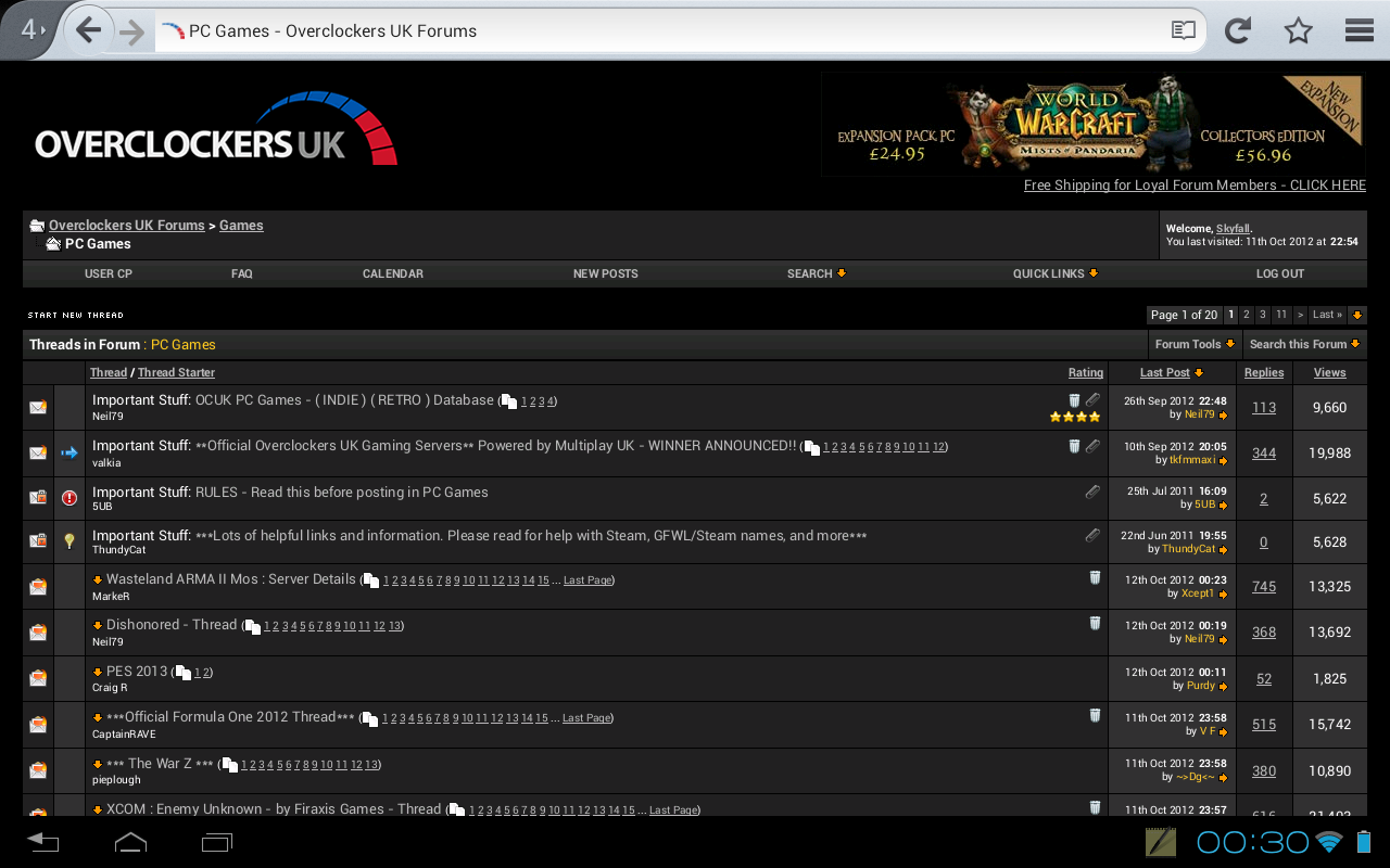
New OCUK Dark theme out now, get it while it's hot!

Status
Not open for further replies.
Guide on how to get dark theme on Android devices:

You can also install straight from userstyles.org in firefox now using stylish as seen here.

This will only work in Opera mobile.

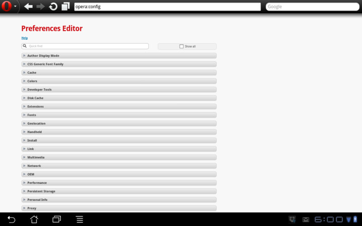
Open up Opera Mobile and type opera:config in the address bar, you should end up with a page that looks like this:
536336476.png


Scroll down to user prefs and scroll further down to find User Javascript & User Javascript HTTPS, tick both of those boxes. Next edit the field User Javascript File and put in /mnt/sdcard/userjs/ click the save button at the bottom.

Next open up a file manager and create a directory on your SDCard called userjs then download the ocuk.js file and put it in that folder:

http://chaoticsignal.com/uploads/ocuk.js

Now restart Opera (you may have to force close it) and OCUK should now be dak on the move too :)

753712529.png
 
Last edited:
Yes I'll list the changes up, it will be mainly to fix some of the bugs people have reported in earlier posts which I've kinda forgotten all about. Issues in usercp and square boxes not working in chrome/others.

Also I don't think there is a way to fix the 'pop in' in chrome from what I've read it seems to be a limitation of the chrome plugin framework.
 
This theme looks great but is there any way to stop the blue flicker when you load a page? (I'm using Chrome)
Fraid not, it's something to do with Chrome itself not allowing stylish some resources or something, because the dark theme is quite big it does take a split second to load, go firefox, no flicker there.

How about sorting out the Favicon as well.
Currently showing as the boggo v-bulletin one :(
The favicon should still work as it's a separate style.
 
Loving this on chrome and FF but i am having an issue with the chrome version not having round quotes even thou i selected it when applying the theme, anyone else having this issue?
It's because I used moz-border radius and I need to update it... Keep meaning to update it but have not had the time, I will pop that quick fix in tonight though.
 
oh i guess the image is different, give me a few mins ill get it sorted.

Edit: Theme updated with pud...

mrk, do you still have the xmas avatars somewhere? I can add them as an option if you link them up :)

Hmmm, editing in the pud seems to have introduced a quick flicker of blue before loading the theme >.<'
 
Last edited:
Yeah that's just chrome and apparently can't be fixed. You get used to it.
Strange thing for me is that it used to do it once in a blue moon, since I updated the style and even if I go back to before I fixed the pud it still does it most of the time.

*shrug*

Also that wink emoticon keeps gaining and losing it's hat randomly.
 
THEME UPDATE 17/01/2013

Quick update for the theme today:

* Added 'Forum Width' option for those that want a fixed width forum
* Added more options for 'Maximum image width'
* Finally fixed the rounded quote boxes!!
* Also changed default image resize back to 'no resize'

Let me know if you need anything else :)

Can't decide whether I like the fixed forum width or not, it's difficult to get used to. Also, if you're using the fixed width option, might be best off using the max image width too.

EDIT: Also finally added a preview image on userstyles:


EDIT2: Added the old Dark logo back into the theme as an option:
402833224.png
 
Last edited:
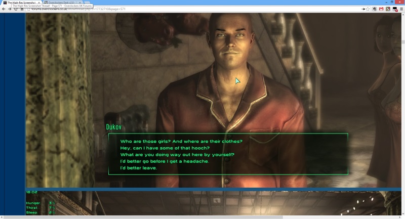
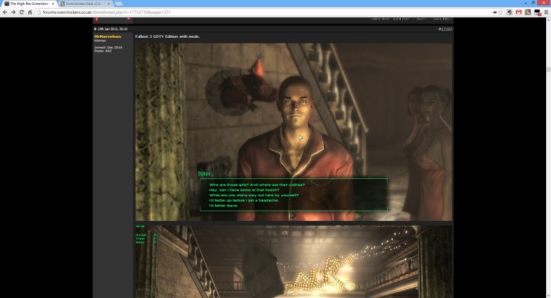
Just popped another little update on... I have really warmed to the fixed forum width and have added some custom max image width options to go with it. Now images that are too large, like (and almost exclusively in) the high res screenshot thread fit nice and snugly. For me it makes browsing the high res thread a dream :)

Before:


After:
 
is there a way to make unread threads appear as a different colour ? because bold white and thin white dont work that well for me =\

If you edit the style and find this bit:

a:link, body_alink{color: #bbb!important}
a:visited, body_avisited{color: #999!important}
a:hover, a:active, body_ahover{color: #fc2!important}

You can change the link colours (in yellow hex values) to something a little more obvious... You can use this to find colours.

I might have a tinker a bit later and if I get some better colours or styles for links I'll add an option on the theme, other people have said the same thing.
 
Last edited:
Thanks, that will give me non-visited threads, i'm more after identifying threads with new content since the last visited though... do you know which hex value that would be?
I don't think there is a way to do that, there is no formatting in the original theme to differentiate between the two. You should see a little orange down-arrow that shows you when there is new content.


Either way I had a good think about the link colours and spent a while changing them about. In the end I decided to change them so they were a little brighter and there was no difference between visited and non-visited, at least for forum and thread links. It looks a lot tidier this way, if you prefer the original with different colours for visited threads the option is there under subtheme. I left pages showing different visited colour because I think that is useful without impacting the flow of the forum.
 
Status
Not open for further replies.
Back
Top Bottom