You are using an out of date browser. It may not display this or other websites correctly.
You should upgrade or use an alternative browser.
You should upgrade or use an alternative browser.
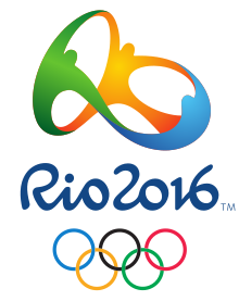
Rio 2016 logo
- Thread starter Craig R
- Start date
More options
Thread starter's postsWhy is this better?How much better than the London monstrosity is this?
Soldato
- Joined
- 16 May 2008
- Posts
- 2,632
- Location
- Bristol
Looks good.. for a butt plug
It's a modern take on a well established theme... the "let's get together with brush strokes and colours" idea. It's alright, nothing amazing but pretty competent.
The moaning about the London 2012 logo has been done to death. I think it's all irrelevant really - they managed to create a distinctive and visually exciting brand and that's mission accomplished IMO.
The moaning about the London 2012 logo has been done to death. I think it's all irrelevant really - they managed to create a distinctive and visually exciting brand and that's mission accomplished IMO.
"Visually exciting" ?! Is that synonymous in hipster-talk for "crap" ?
I don't know, I'm not a hipster. Moan about it all you want, but it did its job

Soldato
- Joined
- 2 Nov 2007
- Posts
- 4,185
I don't know, I'm not a hipster. Moan about it all you want, but it did its job
Looking ugly and geting trashed globally?
Looking ugly and geting trashed globally?
The best design creates debate. Take that from an actual graphic designer, not an armchair critic. It doesn't matter whether you like it or not - how many previous Olympic logos can you remember? They've always been about washed out brush strokes and boringly predictable stereotypes. At least this did something different.
Wolff Olins said:“The critical reviews tend to point out the rules we’ve broken, and in that sense they tend to be correct; the only disagreement is whether those rules need to be broken. Take a look at the attacks: ‘It’s too dissonant.’ Absolutely, the dissonance was intentional. ‘It doesn’t reflect any of London’s famous landmarks.’ Absolutely, the world knows about those, we don’t need to tell them. ‘It’s too urban, it’s too young.’ Absolutely.”
http://99designs.com/designer-blog/2012/08/14/in-defense-of-the-london-2012-olympic-logo/
It broke new ground, it created a distinctive brand and it got people interested in design. What could be better than that?
Soldato
- Joined
- 27 Dec 2005
- Posts
- 17,317
- Location
- Bristol
I liked the London brand in the end, including the logo.
Rio one's ok but nothing different; can't see it being turned into as recognisable a brand as London 2012. There's a million and one logos that look almost identical to it and it doesn't use anything particularly unique.
Rio one's ok but nothing different; can't see it being turned into as recognisable a brand as London 2012. There's a million and one logos that look almost identical to it and it doesn't use anything particularly unique.
The best design creates debate. Take that from an actual graphic designer, not an armchair critic. It doesn't matter whether you like it or not - how many previous Olympic logos can you remember? They've always been about washed out brush strokes and boringly predictable stereotypes. At least this did something different.
http://99designs.com/designer-blog/2012/08/14/in-defense-of-the-london-2012-olympic-logo/
It broke new ground, it created a distinctive brand and it got people interested in design. What could be better than that?
People debating over whether it looks just a bit ugly or if it is a true design abomination isn't really an indicator of good design.
Barely legible? You having a laugh?
London 2012 was one of the best brands I've ever seen.
What barriers did it break? The one where you had to make a crap logo, like pretty much all the previous olympic logos.
It meant to represent the London 2012 Summer Olympics, what did you think it represented?
Rio one looks like it would be better suited in 1996. Bet the branding is just as crap.
so you are talking out of your backside, then?
The Rio logo represents unity (people holding hands), Brazil's culture of colours and dancing (colourful, people dancing), and it EVEN BLOODY SPELLS RIO (it spells Rio!).
London one? Seen better scribbles.
The Rio logo represents unity (people holding hands), Brazil's culture of colours and dancing (colourful, people dancing), and it EVEN BLOODY SPELLS RIO (it spells Rio!).
London one? Seen better scribbles.
so you are talking out of your backside, then?
The Rio logo represents unity (people holding hands), Brazil's culture of colours and dancing (colourful, people dancing), and it EVEN BLOODY SPELLS RIO (it spells Rio!).
London one? Seen better scribbles.
Exactly this. The London one was just some crudely drawn shapes that said nothing about anything.


