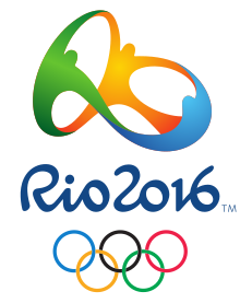
Rio 2016 logo

so you are talking out of your backside, then?

The Rio logo represents unity (people holding hands), Brazil's culture of colours and dancing (colourful, people dancing), and it EVEN BLOODY SPELLS RIO (it spells Rio!).

London one? Seen better scribbles.
The Rio logo suggests unity (using shapes to suggest people holding hands), suggests Brazil's culture of colours and dancing (by using colours and an impressionistic illustration of people dancing), and it BARELY BLOODY SUGGESTS THE WORD RIO (you only know this with certainty because you've been primed with the information).

The Rio branding represents The 2016 Rio Olympic Summer games event. Nothing more. It's the school uniform for that event, and that image at the top is the iron-on badge.

I'm not going to launch into a full-blooded defence of the London 2012 branding because it's going to fall on ears that want to be deaf, but, y'know... IT EVEN BLOODY SPELLED 2012. :p
 
Last edited:
Slick.

220px-2016_Summer_Olympics_logo.svg.png


How much better than the London monstrosity is this?


The London 2012 logo was crap, this is 1000 times better (obviously not designed by the idiots prepared to pay the most £££ for the privilage)
 
The Rio logo suggests unity (using shapes to suggest people holding hands), suggests Brazil's culture of colours and dancing (by using colours and an impressionistic illustration of people dancing), and it BARELY BLOODY SUGGESTS THE WORD RIO (you only know this with certainty because you've been primed with the information).

The Rio branding represents The 2016 Rio Olympic Summer games event. Nothing more. It's the school uniform for that event, and that image at the top is the iron-on badge.

I'm not going to launch into a full-blooded defence of the London 2012 branding because it's going to fall on ears that want to be deaf, but, y'know... IT EVEN BLOODY SPELLED 2012. :p
"It's going to fall on ears that want to be deaf" - so you couldn't actually think of anything, eh?

2012_Summer_Olympics_logos.svg


Spells 2012? You'd have to be told.
 
Either way the Rio logo is crap and the London one is better :) But you guys don't understand branding or design evidently.

There has never been an Olympic event with such great branding. Rio 2016 will suck branding wise.

/exit thread
 
Either way the Rio logo is crap and the London one is better :) But you guys don't understand branding or design evidently.

There has never been an Olympic event with such great branding. Rio 2016 will suck branding wise.

/exit thread

And another reply with no substance to anything, as is typical of designers.

These logos are not for an audience of designers, they are for an audience of everyday people. The 2016 logo means much more to the average person than the random shapes of the 2012 logo do. A logo that has to be explained is a failed logo. A logo that doesn't even represent anything is a worse failure still. 2012 is the latter.

"it's crap" is not factual, reasoned evidence to suggest the 2016 logo is a worse logo than the 2012 logo. It's a hipster designer being butt hurt, is what it is.
 
You get something like that from a $99 logo company.

The 2016 will just get left in the pile with the rest of the Olympic logos. Maybe if they built a better mark as a whole. I am sure any one in the first year of college could knock up something better.

The 2012 one is truly iconic end of, same as Coca Cola, Intel, IBM etc. The Rio one is just another logo.

Its not my fault you don't understand the bigger picture. If you actually read my previous post they do have substance. I didn't fly off the handle like you seem to be. Tarring us all with the same brush heh.
 
Last edited:
See? Deaf :p

Nah, sorry - I'm already eating into my precious Football Manager time as it is. Let's just say that this is a discussion in the field of Graphic Design, Identity, Marketing and Communication, and as much as I respect your knowledge and expertise in other areas, we've both been around here long enough to know that this isn't your field.


[ 2012 logo images ... ] Spells 2012? You'd have to be told.
Hey, I'm not the one defending a "see word in shapes" standpoint. I really hope "See?! It's as illegible as the Rio one!" isn't your trump card :p

Y'know what? I think we should settle this like gentlemen. So: duelling pistols at dawn! Choose your weapon, sir!

You pick the one you think looks best, and I'll pick the one I know has been carefully and deliberately designed to perform its task. Good luck!

Christ, this is taking longer than I wanted. Anyway, my point is that you're all making judgments on a purely visual basis in artificial isolation, and are all wrong. It's not art, it's branding. It has work to do.

Also: Sherbs, you're right, but you're not helping :p :D
 
Last edited:
Both yourself and sherbs mention things like "designed to perform its task" and "it breaks barriers" but neither of you have been able to say what either of those things are ("task" and "barriers"). What was its task? It's a logo. Sure, it's distinctive, I'll give you that much, but so is the word "London" in Verdana, with the Olympic rings under it - as was one of the most popular entries on BBC's "Design a logo" competition in response to how awful the actual logo is.

What "barriers" ? It's a logo, not a cure for cancer.

As for picking a good logo, how about the Open University's logo? Always been a fav of mine. It's the initials (OU), as well as a caricature of a head and brain within.. or perhaps the opening of the mind's eye. But what do I know, I'm not a designer. :p

Even the untrained designer that I am knows a logo must be relevant. The random shapes that don't, intuitively, have anything to do with London, nor the Olympics, and are just about relevant to the year in which the event is taking place - only apparent after you've been told that it isn't Lisa giving Bart oral - is not a successful logo. It's a £500,000 failure.

edit: Innocent's logo is another one that I like. Was designed by a former colleague of mine, and it represents/suggests a child's innocence because it looks like a child's drawing, but also suggests simplicity because it's a very "simple" logo. They want simplicity to reflect that their drinks are very simple. They are simply fruit smoothies without the complicated artificial ingredients etc.
 
Last edited:
The London logo and its branding definitely isn't what I'd call beautiful (the typeface for the games is horrid too), but it's a very effective piece of branding - even when its placed in a sponsor ad and coloured accordingly it manages to remain distinct and recognisable. Wolff Olins managed to give the games an actual identity rather than follow in what people expect from Olympic branding. A logo doesn't necessarily have to be relevant to the company, it just has to be recognisable enough for people to associate it with the company.
 
The London logo and its branding definitely isn't what I'd call beautiful (the typeface for the games is horrid too), but it's a very effective piece of branding - even when its placed in a sponsor ad and coloured accordingly it manages to remain distinct and recognisable. Wolff Olins managed to give the games an actual identity rather than follow in what people expect from Olympic branding. A logo doesn't necessarily have to be relevant to the company, it just has to be recognisable enough for people to associate it with the company.

The Olympics has so much exposure that it is pretty impossible to make it unrecognisable, no matter what the logo looked like.

It could have been a stick with a jobbie on the end of it and it would have been recognisable with the London Olympics if that is what they had plastered everywhere.
 
The Olympics itself is a brand and identity that's all ready sold, all you need is the rings. The ugly, jarring London logo was not iconic and will be as fondly remembered as the trend for neon clothing.
 
btw London is spelt wrong on the 2012 logo

Never liked the London 2012 logo, unfortunately they ran with it, and took it through most of the mechandise. The odd angles were used on nearly everything, must have cost quite a bit to do signs with angled bottoms, odd shaped large screens etc. The colours I think they got right, but I don't like the hard edges. Then the logo doesn't represent anything about the olympics or London, just 2012.

The Rio logo I like, and whoever mentioned, butt plug, I won't be able to look at it the same again, thanks.

Speaking as a designer....
 
Back
Top Bottom