

There was a big spaz-out over the University of Birmingham logo what with petitions and what-not because people thought they were abandoning the crest when they went to modify it. Turns out they didn't, and I personally didn't care that much.
You are using an out of date browser. It may not display this or other websites correctly.
You should upgrade or use an alternative browser.
You should upgrade or use an alternative browser.
Soton Uni Rebranding
- Thread starter Burnsy2023
- Start date
More options
Thread starter's postsAssociate
- Joined
- 18 Oct 2002
- Posts
- 940
- Location
- Manchester
unless its the pink version
Associate
- Joined
- 18 Dec 2005
- Posts
- 1,449
- Location
- Londontown
I like the new Soton one to be honest!
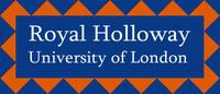
Royal Holloway has seen some rebranding also, I think it's better though:
to

Though personally I think we should have our badass coat of arms in there

Royal Holloway has seen some rebranding also, I think it's better though:
to
Though personally I think we should have our badass coat of arms in there
Soldato
- Joined
- 25 May 2003
- Posts
- 9,361
- Location
- Limehouse
Holloway one looks good actually very nice improvement and gets Founder's on there too.
Oxford's just gone through this process too and though the change isn't as drastic, people were still really annoyed about it.
This

To this ... basically just the outline now and simplified a bit.

My school did it the year I left as well - maybe it's me

This
To this ... basically just the outline now and simplified a bit.
My school did it the year I left as well - maybe it's me
I wonder how many different people we can get posting their own universities logos. Mines gone through a few changes but, personally, for the better in my opinion. I much prefer the new Soton one compared to the dolphin. The dolphin made it look cheaper and not like it was part of the Russell group... more polytechnic like, almost.
- Joined
- 17 Nov 2003
- Posts
- 36,747
- Location
- Southampton, UK
The dolphin made it look cheaper and not like it was part of the Russell group... more polytechnic like, almost.
That seems to be the primary motivation over changing it
Burnsy
Everyone complained about the new kent uni logo too. People were going on about how they didn't want this new logo on their degree certificates because it made it look like a playschool.
Turns out they didn't even put a logo on our certificates.")
Turns out they didn't even put a logo on our certificates.
Soldato
- Joined
- 29 Mar 2004
- Posts
- 2,926
- Location
- Dundee/Forfar
I think there is scope for more identity in the Southampton logo, but font/lettering in the new logo does look better.
On this theme, my university re-branded just before I started there. It went from this (after many adaptations since the University's split from St. Andrews) :

To this in ~2002:

I much prefer the new take on the old logo, as it's simplicity is visually striking an more versatile; such as it's use here:

On this theme, my university re-branded just before I started there. It went from this (after many adaptations since the University's split from St. Andrews) :
To this in ~2002:
I much prefer the new take on the old logo, as it's simplicity is visually striking an more versatile; such as it's use here:
Last edited:
My uni went from this;

to this...

There was a huge fuss over the change at the time. Even a few years later there are still signs brandishing the old logo, which leads me to think that the rebranding was pretty poorly executed. Personally I quite like the new logo")
I quite like the Durham sports teams logo;

to this...
There was a huge fuss over the change at the time. Even a few years later there are still signs brandishing the old logo, which leads me to think that the rebranding was pretty poorly executed. Personally I quite like the new logo
I quite like the Durham sports teams logo;
Last edited:
- Joined
- 17 Nov 2003
- Posts
- 36,747
- Location
- Southampton, UK
nb - I have no idea whether southhampton is any good, just commenting on the logo.
Ranked 80th in the world by THES in 2007. And 14th in the UK by The Times Good Uni guide 2008.
Burnsy