The OcUK NEW Stylish themes thread 2017

Hard to see what threads you've posted in in the new Xen update, otherwise really nice :)

I don't know if it's what you want, but I just edited the relevant lines of code (lines 185-222 in mine) to revert back to the old envelopes and dots. Rather than just outright deleting them, I simply wrapped the relevant lines in /* */.
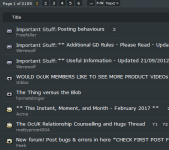
7udscFC.png
 
I don't know if it's what you want, but I just edited the relevant lines of code (lines 185-222 in mine) to revert back to the old envelopes and dots. Rather than just outright deleting them, I simply wrapped the relevant lines in /* */.
Just tried this, looks much better (altho maybe just where I am used to those icons)
I also commented out the icons from front of forum as they don't look too bad with the XEN colours

I added some custom overrides for the front of forum
Code:
.node .nodeIcon {
    margin: 3px 3px 3px 10px;
}
.Popup.subForumsPopup {
    display: none;
}
.node .nodeText {
    margin: 5px 270px 5px 56px;
}
.node .nodeLastPost {
    margin: 5px;
}
.section.threadList {
    display:none;
}
.section.membersOnline.userList {
    padding-bottom: 5px;
}
div#boardStats {
    display: none;
}
just makes things have less padding on frontpage, disables subforums pop-ups, disables boardstats, disables 'new posts' section & adds padding to members online.

I also changed font of codebox to monospace
Code:
.bbCodeBlock .code,
.bbCodeBlock pre {
    font-family: monospace
}
 
Not really a fan of these new logos:

P7O79FA.png

Able to provide the code for the old ones wiiija?

just to confirm the alert notifications we were playing with the other day but couldn't get to reppear to confirm are definitely grey so seems my styling fixed that.

anyone with any requests they want done? happy to help improve the forums if there's anything you'd like changed even if just for you.

Only thing for me is the report etc. buttons overlapping text for users with no sigs with your padding code.
 
nonew.png

new.png
 
Does anybody think the quote boxes should auto size to the content or is it better that they all stay the same size?

*Edit* Tried it, looks odd to me, can stay as it is.
 
Last edited:
Does anybody think the quote boxes should auto size to the content or is it better that they all stay the same size?

*Edit* Tried it, looks odd to me, can stay as it is.
I asume you mean width? If so then no, as its better like it is. :)
 
In fact, I don't even really need those icons in the first place so going to remove them! :p

Not sure what code I need in order to bring the titles into the left though, able to provide the required code please?
 
Finally managed to get some fixes in following the recent forum updates. Should be mostly themed for everybody now I think. I've also hidden the sidebar from bottom of the forum list, it's commented towards the bottom of the code if anyone wants to put it back.
 
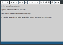
A few issues I've noticed...

1) Why is this spread over 2 lines??

E8VbdwT.png

2) Pressing return in the quick reply dialog adds a blue area at the bottom..

H63gtJP.png

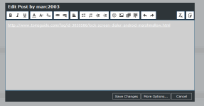
3) When editing a post, hyperlinks are hard to see in the rich text editor

i5v1G9E.png

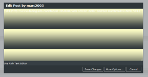
4) Switching from the RTE to BBcode editor using the top right button goes a bit mad... :p

CnJZrPb.png

5) Lastly - a feature request. Could the edit dialog be made bigger? :)

Thanks for everything you've done so far. :cool:

edit: I'm using FF51 if that's relevant.
 
Last edited:
Back
Top Bottom