You are using an out of date browser. It may not display this or other websites correctly.
You should upgrade or use an alternative browser.
You should upgrade or use an alternative browser.
***The Official Samsung Galaxy S III Thread***
- Thread starter uvarvu
- Start date
More options
Thread starter's postsFor folk who don't speak that dialect of Vietnamese he's talking about a Samsung phone and occasionally mentions the words Nexus and samoled, hope that's been a help.
Soldato
- Joined
- 30 Jun 2009
- Posts
- 2,636
- Location
- Surrey, England
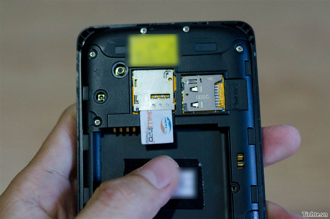
this may be a test design, so the actual look of the phone would change.
I'm hoping for this. There is also some talk that this isnt the galaxy s3 but a phone equivilent to the htc one s, probably completely wrong.
Easiest way is to ask Intra, he would know

A tweaked version of the above photo showing quite how 'engineering sample' this version is.

So you lose some of the screen with this because the softkeys are part of the screen? great
may not be - the final design is mean to have hard buttons.
may not be - the final design is mean to have hard buttons.
I hope so, that would be toss.
I disagree. buttons on screen or off as soft / hard keys means you still have the same amount of space for the screen, but if the keys are part of the screen they can disappear if an App wants the whole screen. OK, in reality most apps appear to leave the buttons there, mostly reducing them to dots but either way you haven't lost screen space, you got a bit extra screen for the buttons. And if you want to hold your phone upside down...
You can also rotate the icons if in landscape and it allows for a reconfiguration of the keys in the future.
I also think the design looks cleaner without a physical button on the front, or a menu and back icon permanently on display.
You can also rotate the icons if in landscape and it allows for a reconfiguration of the keys in the future.
I also think the design looks cleaner without a physical button on the front, or a menu and back icon permanently on display.
OK, in reality most apps appear to leave the buttons there
Exactly my point though!
Hmm, that 4.6" mule sample is virtually identical to the 4" one. Both have the i9300 model number...
Maybe the Exynos 4212/WSVGA variant was just to throw people off? God I hope not, Samsung's name would be dirt to me, dirt I tells ya!!


What's new?trollolololololololol
What's correct?
and when the hell will it be available in Brazil?


 its as dummy as it gets tbh.
