

You are using an out of date browser. It may not display this or other websites correctly.
You should upgrade or use an alternative browser.
You should upgrade or use an alternative browser.
What watch do you wear?
- Thread starter Doran
- Start date
More options
Thread starter's postsAssociate
- Joined
- 19 Oct 2002
- Posts
- 765
Having spent a while umm-ing and arr-ing, finally bit the bullet and made a purchase:

Terrible picture I'm afraid - looks so much better in real life...")
Terrible picture I'm afraid - looks so much better in real life...
Last edited:
And the Black Bay warranty works seem to continue  Wonder wtf is going on with those movements?
Barton Bands have a new range of tropic straps out, quick release, locking keeper system, taper and not silicone but TPU rubber, so dust proof: https://www.bartonwatchbands.com/collections/tropical-style-quick-release-watch-bands
Tempted to buy one just for curiosity see what they're like.
Edit*
Nice Aquascaphe!
Wonder wtf is going on with those movements?Barton Bands have a new range of tropic straps out, quick release, locking keeper system, taper and not silicone but TPU rubber, so dust proof: https://www.bartonwatchbands.com/collections/tropical-style-quick-release-watch-bands
Tempted to buy one just for curiosity see what they're like.
Edit*
Nice Aquascaphe!
Last edited:
Mine too, absolutely no complaintsSomething in wrong with some black bays ? Mine is keeping excellent time
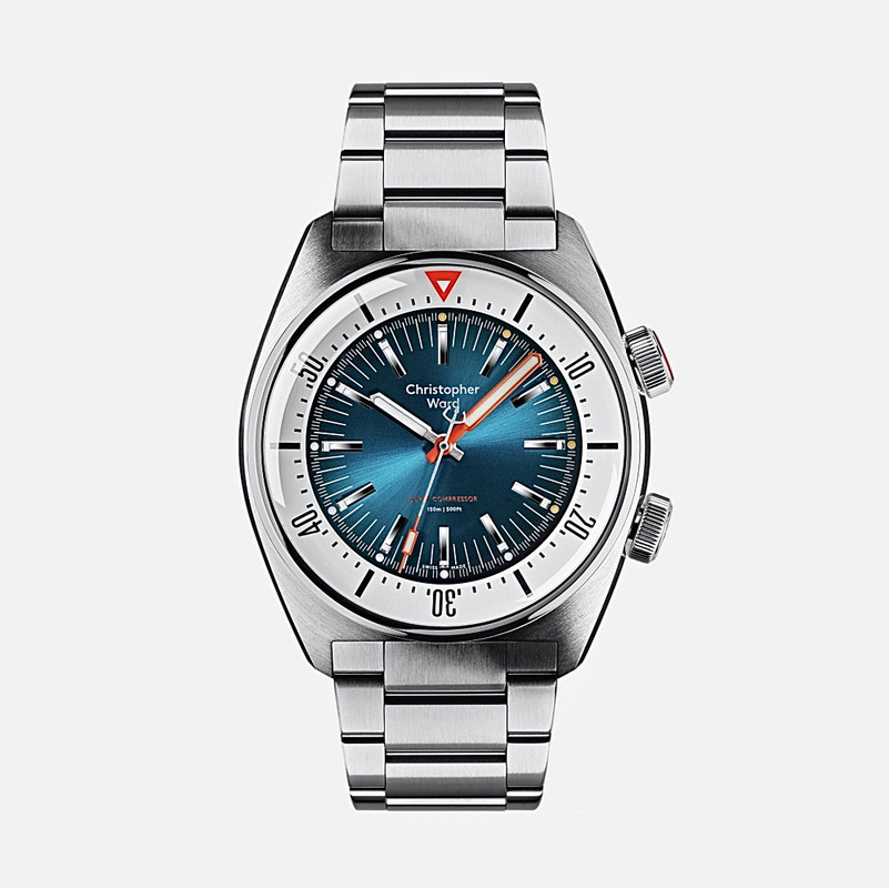
Just my opinion of course, but I think that is one of the outright ugliest diving watches I have ever seen. The bright red hand and 12 o clock bezel marking looks cheap and garish. The CW logo also looks really crap now that it is typed out in full words with that inelegant and overly rounded font. And for a grand? Christ.Considering one of these as my next buy. Liking the contrast between the white “bezel” and blue watch faceedit - Christopher Ward C65 Super Compressor, 41mm, and 47mm lug to lug.

I would take my budget elsewhere and get a watch from a more respectable brand with some pedigree and design chops that will actually hold some value. CW is imo a second-rate brand that capitalized on the initial popularity it had for providing elegant Swiss-made watches at reasonable prices then got carried away and priced itself out of the market a while ago.
For a grand I would rather get a Longines Hydroconquest which is imo a timeless design https://www.watches-of-switzerland.co.uk/Longines-Conquest-VHP-Mens-Watch-L37424566/p/17470176
Last edited:
Beauty is in the eye of the beholder. By contrast, I really like the look of that CW watch precisely because of the red contrast markings! I wouldn’t give the Longines a second look. To my eyes it’s bland, dull and just like every other diving style watch on the market. That’s why it’s a timeless design - it’s dull. Complete snoreville.
Indeed ! I think CW stands out from the crowd, and is a bit different. Which is what interested me in the first placeBeauty is in the eye of the beholder. By contrast, I really like the look of that CW watch precisely because of the red contrast markings! I wouldn’t give the Longines a second look. To my eyes it’s bland, dull and just like every other diving style watch on the market. That’s why it’s a timeless design - it’s dull. Complete snoreville.

Indeed ! I think CW stands out from the crowd, and is a bit different. Which is what interested me in the first place
We’re singing from the same hymn sheet. The red hands, the blue face and the white surround are all plus points for me. CW has produced some really interesting designs recently. It’s definitely a brand I’m keeping a close eye on.
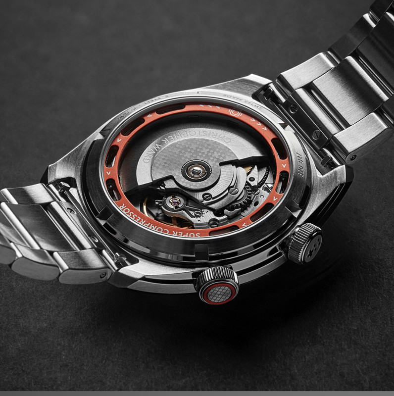
Aye. They do have some very nice pieces. I’d never heard of them until I started browsing watch forums. The case back looks great on the c65We’re singing from the same hymn sheet. The red hands, the blue face and the white surround are all plus points for me. CW has produced some really interesting designs recently. It’s definitely a brand I’m keeping a close eye on.
Ive got the C60 sapphire, which i think is a very nice watch. They've since bought out the orange and black versions which also look pretty cool.
That Super Compressor was heavily marketed about 6 months ago and I really disliked it, I saw it on the occasional 'nearly new' section on the website sub £500. Ive since seen it in the flesh and changed my mind completely and kicked myself for not picking it up at that sort of price.
If your in the vicinity of Maindenhead theyve got a showroom somewhere around those parts.
Thanks for the tips fellas ! I can actually bag one, brand new for £830 ! I know someone selling one as they bought the wrong colour.
I'm sure i keep receiving a discount code of Loupe20 or Loupe12 for the £100 off. Unfortunately I think I've deleted my emails with the code on it.
Soldato
- Joined
- 25 Nov 2005
- Posts
- 12,674
I want the New CW C65

Having spent a while umm-ing and arr-ing, finally bit the bullet and made a purchase:

Terrible picture I'm afraid - looks so much better in real life...
Good choice; it's a smart looking watch. I'm considering getting one in favour of the MKii Tornek Rayville, which seems perpetually out of stock.
Same. Lovely looking watch and only £600.I want the New CW C65

Associate
- Joined
- 19 Oct 2002
- Posts
- 765
Good choice; it's a smart looking watch.
Thank you - I have to say I am really pleased with it. I took @mrk's advice (always a good thing to do!) and asked for a blue tropic strap rather than the standard black - which really compliments the overall colour scheme.