COMPETITION - Design a System Landing Page for the new Antec Custom Cases - WINNER ANNOUNCED!

Okay, here's my effort.

Comp-1_High_840.jpg


There's some seriously good entries so far. Good luck to everyone!

:)
 
I wonder if some people can give me some feedback on my progress so far. I just want to know whether other people's monitors display any anomalies. With things blended from black it often varies screen to screen. This isn't anywhere near done of course - so please don't point out that it's light on text!

35lhiqx.jpg
 
Updated mine, tweaked it a little bit, gave it a red and black theme so it would fit in with OCUK Site, blue one still available if that one is preferred:
 
Last edited:
My last design variation with OcUK Site Headers and Navigation.

Site.jpg


I think it works well, there is a good quantity of information before the most common resolution cut off, so any "1 click and away" people see all 3 cases without even having to scroll.

What do you guys think! Any suggestions that I can do in 3 days?
 
I have also previewed what mine shall look like as a landing page:
ocuknew.jpg

Looks weird as I had to resize the image but ah well :)
Also gratz to the others, really nice work. :D
 
Finally managed to get some time in to squeeze out a couple of entries!

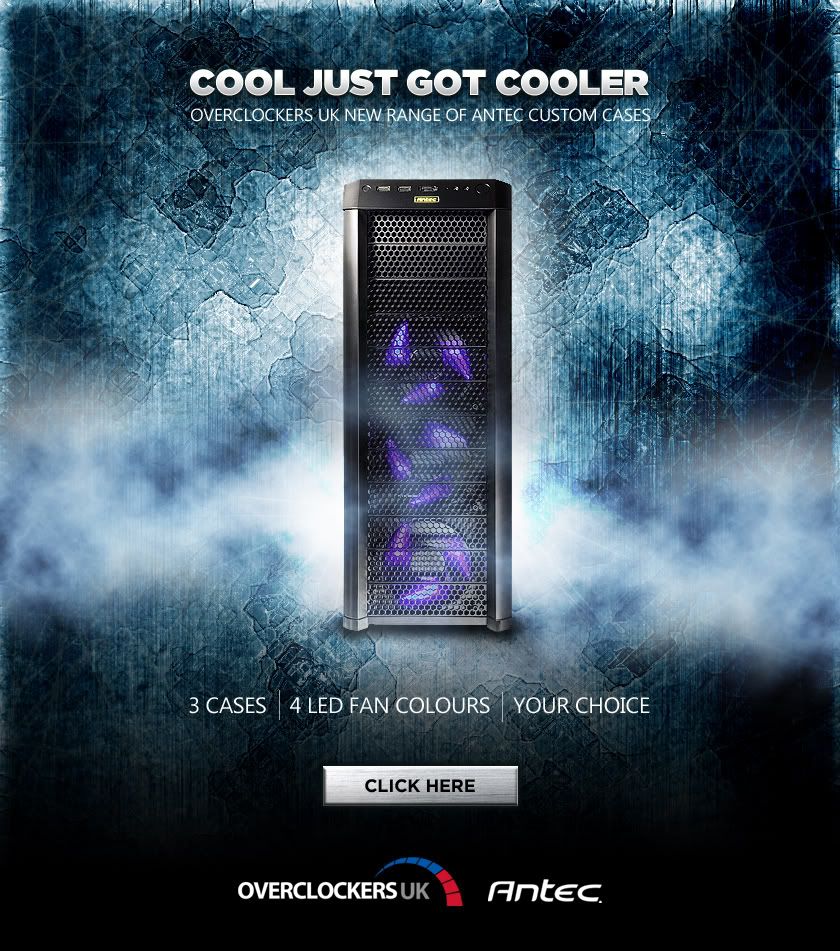
I took the liberty of going off brief for my first one as I wanted to keep it quite minimal with some strong imagery to act as a lure to click directly through to http://www.overclockers.co.uk/productlist.php?groupid=701&catid=7&subid=2137 I thought that once there you could see all the specs and prices and so I could keep the design uncluttered.

OCUK-COMP-1.jpg


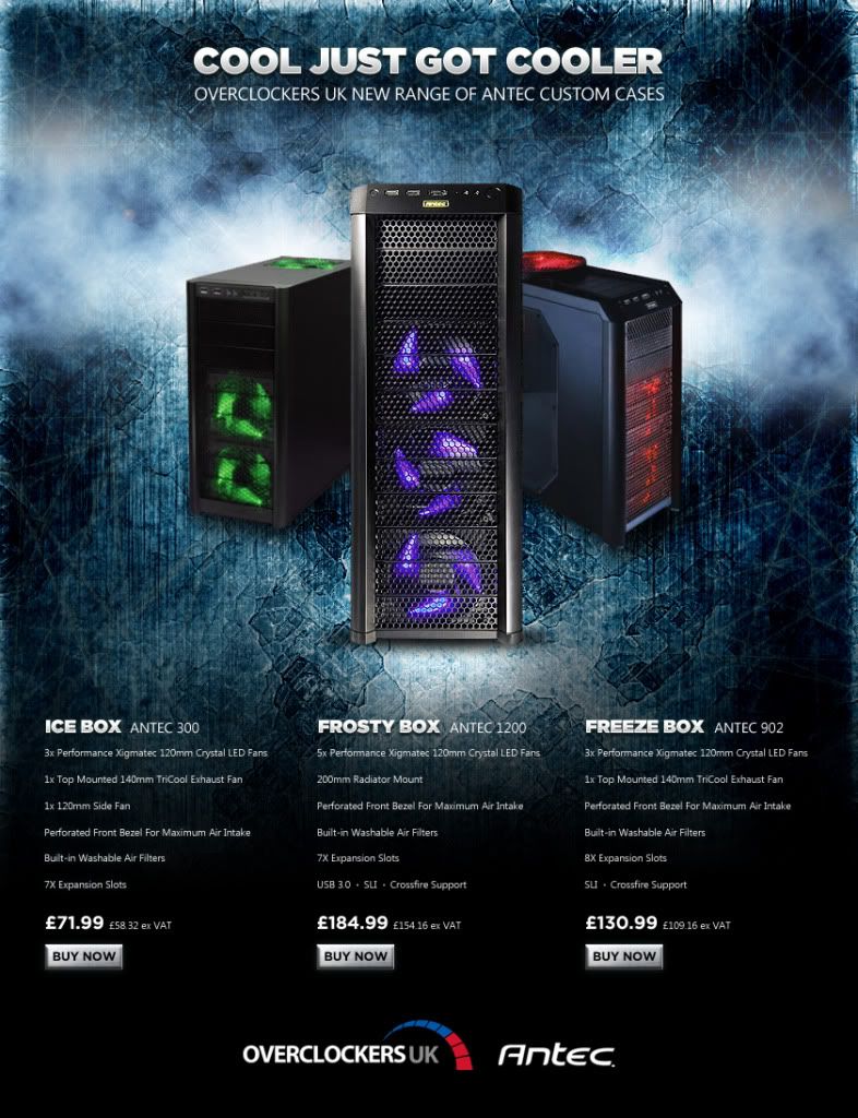
I then did a version with all the gubbins listed in the brief...

OCUK-COMP-2.jpg
 
Back
Top Bottom