I wonder if some people can give me some feedback on my progress so far. I just want to know whether other people's monitors display any anomalies. With things blended from black it often varies screen to screen. This isn't anywhere near done of course - so please don't point out that it's light on text!
Updated mine, tweaked it a little bit, gave it a red and black theme so it would fit in with OCUK Site, blue one still available if that one is preferred:
Updated mine, tweaked it a little bit, gave it a red and black theme so it would fit in with OCUK Site, blue one still available if that one is preferred:
Looks pretty good... think I liked the blue one better though.
I like the idea of putting the sites Header and Nav bars around it too may try that later!
Updated mine, tweaked it a little bit, gave it a red and black theme so it would fit in with OCUK Site, blue one still available if that one is preferred:
My last design variation with OcUK Site Headers and Navigation.
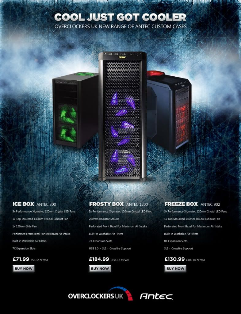
I think it works well, there is a good quantity of information before the most common resolution cut off, so any "1 click and away" people see all 3 cases without even having to scroll.
What do you guys think! Any suggestions that I can do in 3 days?
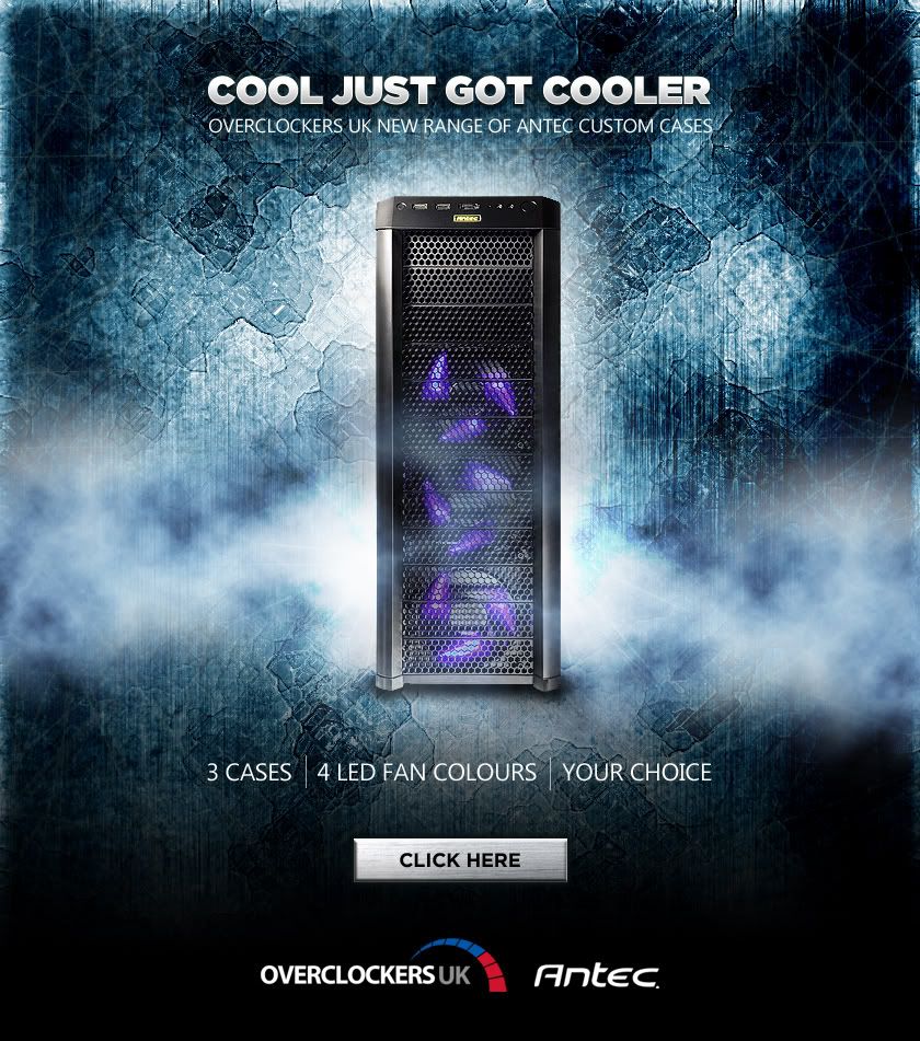
Finally managed to get some time in to squeeze out a couple of entries!
I took the liberty of going off brief for my first one as I wanted to keep it quite minimal with some strong imagery to act as a lure to click directly through to http://www.overclockers.co.uk/productlist.php?groupid=701&catid=7&subid=2137 I thought that once there you could see all the specs and prices and so I could keep the design uncluttered.
I then did a version with all the gubbins listed in the brief...
This site uses cookies to help personalise content, tailor your experience and to keep you logged in if you register.
By continuing to use this site, you are consenting to our use of cookies.


")