

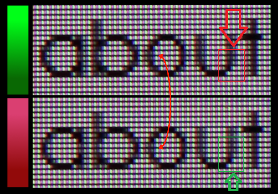
^^ look at the vertical bit of the u - AMD gets a crisper o at the expense of making the u thinner than it should be. (not to mention the difference is tiny). The vertical section of the u isn't actually better as it is displayed incorrectly as too thin.
-
Competitor rules
Please remember that any mention of competitors, hinting at competitors or offering to provide details of competitors will result in an account suspension. The full rules can be found under the 'Terms and Rules' link in the bottom right corner of your screen. Just don't mention competitors in any way, shape or form and you'll be OK.
You are using an out of date browser. It may not display this or other websites correctly.
You should upgrade or use an alternative browser.
You should upgrade or use an alternative browser.
AMD Vs. Nvidia Image Quality - Old man yells at cloud
- Thread starter shankly1985
- Start date
More options
Thread starter's postsIt can't be thinner than it should be. Parts of the image can't be removed, only distorted.
It doesn't have the same weight in the middle which gives it the appearance of being thinner and less defined versus how the font is supposed to look (same kind of thing can happen with incorrect RGB v BGR, etc. pixel layout settings and so on).
Soldato
- Joined
- 19 Oct 2008
- Posts
- 6,066
Share some with me?This again. Pops out to get some popcorn
On balance the NV one is the better quality. The U look better defined which is a large portion of the image than the little o being analysed. Similarly for the straight part of b too.
It really doesn't matter. Unless staring at a static image and looking for imperfections nobody will notice in games. It's a balance of FPS vs IQ.
I think people see what they wanna see. It's like a strict religious person seeing Jesus in their morning coffee
.^^ look at the vertical bit of the u - AMD gets a crisper o at the expense of making the u thinner than it should be. (not to mention the difference is tiny). The vertical section of the u isn't actually better as it is displayed incorrectly as too thin.
It doesn't have the same weight in the middle which gives it the appearance of being thinner and less defined versus how the font is supposed to look (same kind of thing can happen with incorrect RGB v BGR, etc. pixel layout settings and so on).
The "u" on the Radeon is better - it is crisp, slim and thin, rather than fat and blurry on the nvidia image.
On both images, the "u" takes two-pixels width, but the nvidia image processes the neighbour pixels making them darker. While on the Radeon image, there is a clear and clean boundary.
I think people see what they wanna see.
Except that nvidia processes the graphics in a different way, applying a filter and compression. Now, discuss on technical merits, not with sarcasm and cynicism.
Look at how the bottom right curve on the "u" is smoother on the Radeon, while on the nvidia it is jagged, I mean there is one pixel there which is lighter on the Radeon and it makes the difference:
Last edited:
Share some with me?
On balance the NV one is the better quality. The U look better defined which is a large portion of the image than the little o being analysed. Similarly for the straight part of b too.
It really doesn't matter. Unless staring at a static image and looking for imperfections nobody will notice in games. It's a balance of FPS vs IQ.
I think people see what they wanna see. It's like a strict religious person seeing Jesus in their morning coffee
I usually buy in bulk (needed with this forum) so happy to share

A lot of people see what they want to see I agree. 4K8K comes to mind
You're sitting too close!
That is true. I was one of the few back in 2014 saying 4K looks much better. People were like nah... Apparently they had seen them side by side with 1440p and they looked the same. Erm.. Yeah...A lot of people also don't see what they don't want to see.")
Jokes aside, I do get that if you sit far enough than sure you cannot see the difference. It seems I sit closer to my monitor than most and some sit 4ft away which I did not think was even a thing until recently.
Last edited:
The "u" on the Radeon is better - it is crisp, slim and thin, rather than fat and blurry on the nvidia image.
On both images, the "u" takes two-pixels width, but the nvidia image processes the neighbour pixels making them darker. While on the Radeon image, there is a clear and clean boundary.
The ideal when rendering a font is to have consistency in weighting both are going about it in slightly different ways - the vertical bits on the u are supposed to be heavier than the appearance on AMD at normal viewing distance it makes the u thinner and less distinct not clean and clear.
Permabanned
- Joined
- 27 Sep 2019
- Posts
- 2,570
The bottom one (RED) is blurrier that is all simple as that.
Permabanned
- Joined
- 27 Sep 2019
- Posts
- 2,570
Or smear Vaseline on your screen.
Soldato
- Joined
- 17 Aug 2003
- Posts
- 20,160
- Location
- Woburn Sand Dunes
^^ look at the vertical bit of the u - AMD gets a crisper o at the expense of making the u thinner than it should be. (not to mention the difference is tiny). The vertical section of the u isn't actually better as it is displayed incorrectly as too thin.
All of the uprights are more consistently rendered on the nvidia capture. I couldnt be bothered to mention it last time this was brought up. I find it amusing how that's ignored and 4K and his posse have decided that sharper is better, even if it's not as accurate. A bit like AMD's more saturated image - I provide a link that shows the AMD's saturated image over HDMI is less accurate than nVidia's and that gets ignored too. Funny that
All of the uprights are more consistently rendered on the nvidia capture.
This is dishonest. What do you mean by "more consistently" when the nvidia image is blurred very badly, so badly that the distance between the "a" and "b" is only 1-pixel width, while on the Radeon font it is 2-pixels width?
This is dishonest. What do you mean by "more consistently" when the nvidia image is blurred very badly, so badly that the distance between the "a" and "b" is only 1-pixel width, while on the Radeon font it is 2-pixels width?
Someone needs to setup their monitor correctly... are you sure your display is doing full range RGB?
Neither is 100% accurately rendering the font at that size - both are very slightly different approaches with different positives and negatives.
Soldato
- Joined
- 17 Aug 2003
- Posts
- 20,160
- Location
- Woburn Sand Dunes
This is dishonest. What do you mean by "more consistently" when the nvidia image is blurred very badly, so badly that the distance between the "a" and "b" is only 1-pixel width, while on the Radeon font it is 2-pixels width?
It's not dishonest in the slightest, I call it as I see it. I said the uprights are rendered more consistantly and they are. I didn't say the nvidia rendering was perfect. Dishonest is finding fault in one and ignoring any faults in the other. Like you do.
It's not dishonest in the slightest, I call it as I see it. I said the uprights are rendered more consistantly and they are. I didn't say the nvidia rendering was perfect. Dishonest is finding fault in one and ignoring any faults in the other. Like you do.
Unfortunately, Matrox don't make graphics cards, anymore. If they did and kept the legacy image quality, I'd use their products.
But between Radeon and GeForce, the Radeon looks more like complying with the graphics standards, while the GeForce violates them and offers blurry, washed out and false image.
I know the Matrox G400Max has great 2D quality
I've seen the V5 running on a 19" 769 Hitachi monitor at my friend's, in 1280x960 (or whatever). It looked CRYSTAL clean. Diablo 2 looked beautiful on that, and then I saw Diablo 2 running on my other friend's V3 with a generic 21" monitor, and it looked significantly more pixilated. It may just be the monitor (the fact that it's 2" larger).
But nevertheless the 2D output from the V5 on my friend's hitachi much surpassed even my own, on my 17" vivitron running on a Matrox Millenium. I mean I could look at a jpeg on his screen, and then on mine, and the two pictures were visiably different. It's quite amazing.
1.Matrox had great image quality,exellent as a matter of fact.
The 2d on the V3 is really excellent, the colors on Nvidia products look less vibrant and colder(even after gamma adjustments etc.). From what I've heard the V5 is slightly better but I have yet to see one in action.
The G400 MAX is hands down the best looking 2D card. It's primary output is amazing, and nothing else compares, especially when at 1600x1200 or 1280x1024 for long periods. I've seen other people's TNT2/GeForce systems. I was not impressed.
Let's just say, the V5-5500 has excellent 2D.
I went from a G400 to a Asus GeForce - I certainly noticed a difference there. Was never happy with 2D on the GF. Went from the GF to the V5, and 2D is again clear, bright and crisp.
https://arstechnica.com/civis/viewtopic.php?f=6&t=1065494
Hi,
I have a Matrox Millenium II graphics card (MIL2A/8) and a Nvidia GeForce 2 MX400 graphics card and wanted to know which is better out of the two?
Millenium II is superior for 2D.
yea, that geforce won't net you any results in modern games, so since that narrows the column to only 2d applications, Matrox wins. Destroys is the better term.
The millenium is excellent for 2d. It will give you sharper text overall, espicalyl at higher resolutions.
Matrox hands down if your not gaming.
https://forums.anandtech.com/threads/matrox-vs-nvidia.1819821/
Soldato
- Joined
- 17 Aug 2003
- Posts
- 20,160
- Location
- Woburn Sand Dunes
I provide a link that shows the AMD's saturated image over HDMI is less accurate than nVidia's and that gets ignored
the GeForce violates them and offers blurry, washed out and false image.
*shrugs*