Caporegime
- Joined
- 1 Mar 2008
- Posts
- 26,303
Deadline is this friday")
I thought it was the 9th?
EDIT: Oh, that's when a winner is chosen.
Thanks for the heads up.
Deadline is this friday
And just like the logo thread, a graphic designer (obviously) signs up and runs away with the thread
It's very nice though, Razerlution.
Superb effort by Skippi too.
") Did some photoshop at college and been playing around with the program ever since. More of a hobby Thought it would be nice to have an actual goal for a change lol. (And yeh, the case is nice!
Did some photoshop at college and been playing around with the program ever since. More of a hobby Thought it would be nice to have an actual goal for a change lol. (And yeh, the case is nice!  )
)Nope, no graphic designer, software tester
And I agree mine is definately not as "clean" as some of the other entries. A lot of nice ideas floating around here no doubt.
Raz


And just like the logo thread, a graphic designer (obviously) signs up and runs away with the thread
It's very nice though, Razerlution.
Superb effort by Skippi too.
I bet like myself a lot of people won't put it in till the end, so as not to have ideas stolen.I knew it!
It's a very nice effort though. There are only a few things I'd change and tweak, but then I spend hours tweaking everything about anything I do. And it's even worse when you're designing for yourself. Every idea gets scrapped and you start again.
I've spent way too long on this than i had originally planned lol.
After removing the alien/laser, the middle was completely dead, tried the acid, but ended up looking very off. Didn't know what else to put in the middle so ive devided it up and made the whole thing look like a computer screen/ish.
Anyway, time to wash the car.


Raz's entry with nicer looking fand but with Aiir's txt style would do it for me

The text in Aiir's entry is it's downfall.
It's very difficult to read.
Indeed, though that may be due to the fact its so small.
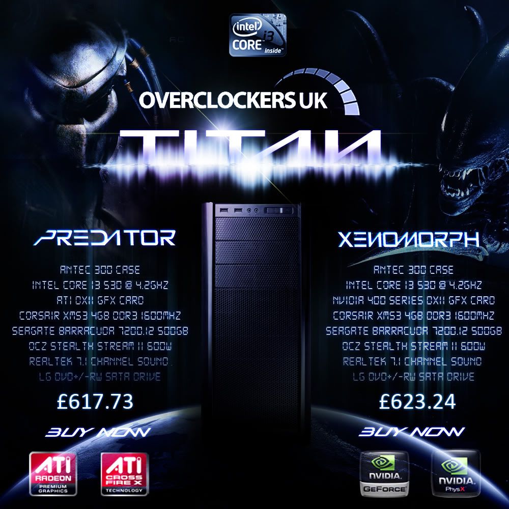
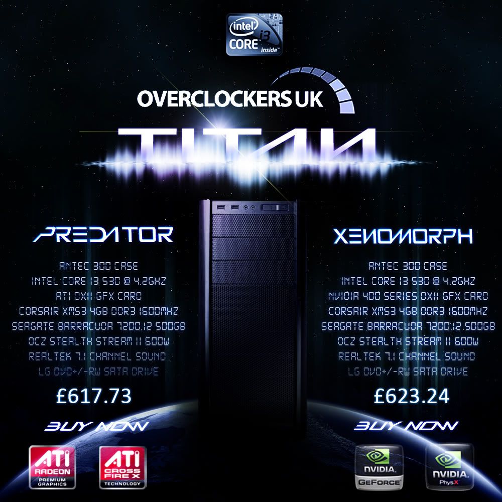
Yeah could, might stick a planet in or somthing. Just keeps things even and tidy. Might just lift everything up a little.2nd one looks a bit empty. 1st looks good. Would change the colour of the yellow flare lines if it was me.
Nice.
Yeah could, might stick a planet in or somthing. Just keeps things even and tidy. Might just lift everything up a little.
Much prefer the second one, less cluttered, nice one. Good to see someone break the red/green trend. I'm going to try and refrain from posting mine till the end though.
Bloody planets. I knew I should have posted mine later.
I joke, I joke!
Your first is my fave so far with Gord in second and Sp00n in third.
Think I might make a whole different new one, with a jungle theme.