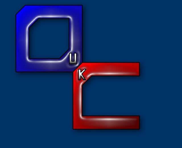
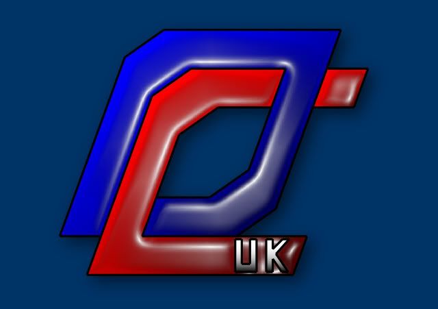
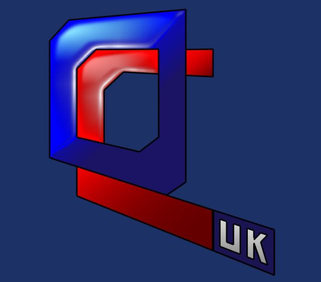
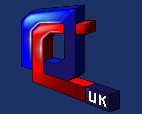
I think these sort of ideas were the best implementation of colour for my idea. Colouring the text just look wrong. gord's alteration with the flag is interesting still though.
I did play with italics due to the current logo, but it didnt sit right.
The problem with italicising the OcUK is that the O becomes unsymmetrical and doesnt look like the middle pin of a fan, so it works against the fan concept.
I've also tried using a sharper font.. but it doesnt look right either at the moment..


