

Don
The Forum Update is now live - please post any issues in this thread
Please disable any custom Themes before reporting any issues!!!
Known Issues:
- Functionality -"Show OP" checkbox not implemented yet
- Functionality - clicking on a thread title should take you to the first post. Both this AND clicking the envelope currently take you to the first unread post. Clicking the thread needs to change to first post.
- Functionality - Clicking the envelope on threads where there are no unread posts (so the envelope is grey) should go to the most recent post in the thread, ie the last post post on the last thread, not the very first post in the thread.
- Functionality - This envelope no longer does anything whereas it used to, just a few days ago

- Visual - In the rich text editor, if you highlight text, it's only visible in blue and alternate modes, it's effectively invisible in dark and green modes. See here and here.
- Other - Can the Text Colour Picker have "bright" colours added e.g. Red-FF0000, Yellow-FFFF00, Green-00FF00 etc. - The default selection should be good enough - Should be but is really needed for the moderating team so that when we add a comment, it stands out nicely.
- Bug - Collapsed forum sections seem to automatically uncollapse themselves after a few days. ** mod note, there's a 'direct cookie expiration value' setting for CollapsibleCategory, does this need to be extended to some obscenely huge number to fix this? **
Not an issue/intended/required xenforo developer fix:
Fixed:
Please disable any custom Themes before reporting any issues!!!
Known Issues:
- Functionality -"Show OP" checkbox not implemented yet
- Functionality - clicking on a thread title should take you to the first post. Both this AND clicking the envelope currently take you to the first unread post. Clicking the thread needs to change to first post.
- Functionality - Clicking the envelope on threads where there are no unread posts (so the envelope is grey) should go to the most recent post in the thread, ie the last post post on the last thread, not the very first post in the thread.
- Functionality - This envelope no longer does anything whereas it used to, just a few days ago
- Visual - In the rich text editor, if you highlight text, it's only visible in blue and alternate modes, it's effectively invisible in dark and green modes. See here and here.
- Other - Can the Text Colour Picker have "bright" colours added e.g. Red-FF0000, Yellow-FFFF00, Green-00FF00 etc. - The default selection should be good enough - Should be but is really needed for the moderating team so that when we add a comment, it stands out nicely.
- Bug - Collapsed forum sections seem to automatically uncollapse themselves after a few days. ** mod note, there's a 'direct cookie expiration value' setting for CollapsibleCategory, does this need to be extended to some obscenely huge number to fix this? **
Not an issue/intended/required xenforo developer fix:
- You cannot choose your avatar (but couldn't pre-update)
- Trust has been disabled - There is now a new feedback tab which should show all of your MM Trust feedback
- Functionality - Can't disable push notifications in settings page (stays as "on") - Note: Can not reproduce, please clear cookies and caches in your browser and try again.
- Visual - Emails being sent for alerts/notifications are using a very vibrant colour scheme that needs toning down - Appears to be mac specific something to do with nighttime mode or similar?
- Doesn't show who posted last in on mobile theme - Gets very messing displaying this info
- Visual - Spoiler button is not themed correctly on all themes (it is on Alternate style) - Matches other buttons based on the theme selected
- Functionality - Custom User Titles are missing
- Visual - Online indicator doesn't match up with the list on the forum home page. Members can have a green dot but not show online in the list (this is not down to people hiding their online status).
- Functionality - users can react to posts in threads that are closed
- Functionality - In the alerts drop down, can the text "There may be more posts after this." be removed please? It would just tidy it up and allow more alerts to be displayed.
- Functionality - Can the Watched threads by default (or an option) hide threads that have already been read. The view is really messy compared to how it used to be.
- Colour palette picker at top of page not visible in mobile theme portrait. It’s there in landscape. - Space needed as screen shrinks
- Other - When merging threads, can the default option be to leave a redirect for one day rather than 'no redirect'
- Functionality - Not possible to copy/paste/edit quotes without toggling BBCode
- Visual - Looking at the newest members page, it only shows avatars, no names. See here
- Functionality - Alerts - can they always show the "mark unread" little dot when viewing on desktop (as they currently do on mobile), rather than only showing when you mouse over. Not relevant on desktop
- Bug - Problem with following links from search engines if uBlock Origin ad blocker is installed. Discussed at length here and mentioned again here. Although it may seem like this is an adblocker issue, it didn't happen with the old forum and doesn't appear to happen with other Xenforo 2 sites. - This can be repproduced on other sites, unsure on exactly what is causing it have contacted ublock but seems to be something to do with referer links?
- Bug - When quoting someone who has tagged a member, the tag details are shown in bbcode, even using the fancy editor. See here. Update - It's not just tags, it's other bbcode as well, another example is here. - XF issue / not a bug
Fixed:
- Search option when viewing a forum/thread is defaulting to "Everywhere" rather than "This Forum"/"This Thread"
- Search option "search only containers" - what is this?
- Some Users' Men of Honour avatars appear to be incorrect
- green theme missing from theme colour palette
- Hovering over the colour palette icon has the American spelling for 'colour' (http://i.imgur.com/ZOkuR47.png)
- Navigation "breadcrumbs" could do with a "Forums>" option before e.g. Life>General Discussion at both top and bottom of page
- Reactions to a post moves the button up slightly
- Hide avatars option not working
- Minor visual issue: "Settings" subheader in user preferences page is not obvious that it is a subheader when using "Dark Style"
- Images in quotes need reducing in size (as per before)
- Join date, number of posts and location for each user aren't displayed within a thread
- icode tags aren't very visible on blue or dark themes
- no manual page number selection (e.g. where you could previously type a number)
- Post counts etc missing in mobile theme
- Skip to specific page only at the bottom of threads, not top and bottom (desktop has both)
- Possibly page numbers don't show at all for threads in portrait mode
- Username and Thread title could do with being coloured in Alerts section e.g. https://forums.overclockers.co.uk/t...he-op-for-known-issues.18951336/post-35582644
- The old version had a full breadcrumb trail of links, so if you were in a Football Stadium thread for example, you could hit Forums or Life or Sports Arena or Football Stadium depending on how far back up the tree you wanted to go. Now it only shows one level, so it's multiple clicks to get back to the Life forum if you're in a Football Stadium thread. It's much slower, with multiple page loads and multiple interactions needed. The links are there in landscape, it'd be nice to have them in the portrait view too though.
- Visual - Squashed avatars when previewing a user profile
- Visual - User online indicator is centred on desktop but offset on mobile. Needs to be consistent on both (offset).
- Visual - Envelope icon with the dot looks a little odd, could need tweaking
- Visual - Quoted text colour (yellow) needs looking at
- Functionality - Clicking the OcUK logo opens the store in the same tab - previously it opened in a new tab
- Functionality - The ‘home’ link (bottom right) goes to the shop site, not the forum home.
- Breadcrumbs aren't consistent with desktop version - should go >>>> this way. The spacing is also incorrect as mentioned in the Visual section above.
- Page numbers of a thread not shown in forum view
- Bug - Avatars flickering with placeholder e.g. https://forums.overclockers.co.uk/t...he-op-for-known-issues.18951336/post-35582731 - Probably only in Firefox (Possible Fix)
- Edit button not visible by default on mobile theme
- Avatars to be hidden on mobile
- Tapping the shop logo opens in the same window/tab, not a new one (on mobile)
- Visual - User online indicator sits directly over year text for Men Of Honour (Suggest moving as far left as possible)
- Functionality - quoted images need to be smaller than the original as per the old forum behaviour
- Visual - No online indicator when avatars are switched off. It used to be a triangle in the top left corner above the member name, see here for an example.
- Visual - Gap between a quote and new text needs increasing. Looks squashed.
- Visual - Gap between forum sections (breadcrumbs) in mobile theme is not evenly spaced (pic here). Also, the chevrons are backwards on the mobile theme as mentioned below.
- Visual - Signatures being slightly cut off at the bottom, and also potentially wrapping of very long lines that wasn't an issue before
- Visual - ... more options menu on posts (even though all the options are shown as buttons - e.g. Edit, and the Mod tools where relevant)
- *Urgent* Functionality - Users cannot see the deleted message “message deleted. Reason:” placeholder - Placeholder added for now, just need to remove the postbit styling to place the username without avatar/location etc. ** mod note, the reason a post has been deleted needs to be visible **
- Functionality - Please can we have an option at the bottom of each page to go to the top. Getting the little silver arrow to appear means unnecessarily scrolling.
- Permissions - Not all users can rename their threads in the MM - permissions issue?
- Long user locations need line breaks, as they push usernames onto multiple lines and break the formatting
- Functionality - Bulleted and numbered lists are not available to create in posts
- Functionality - Remove the 'more options' bit for horizontal line, spoiler and code inserts when creating a post, display them inline like the rest of the post options
- Visual - https://forums.overclockers.co.uk/account/alerts needs the thread and user names colouring to match the alerts flyout
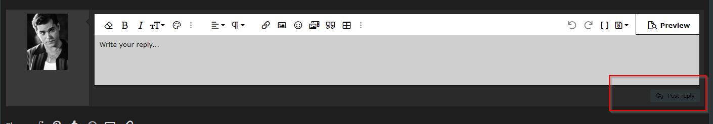
- Functionality - Clicking the three vertical dots at the right of the compose post window only brings up one icon, the one for deleting or saving a draft. I think that means the three dots are redundant and could just be replaced with the save/delete icon. It's an unnecessary click. See here.
- Bug - Clicking post links sometimes results in correct post not being scrolled to @Armageus has reproduced, and possibly similar issue: https://forums.overclockers.co.uk/t...he-op-for-known-issues.18951336/post-35582798 -May be if your browser isn't maximised to full screen, Also mentioned here: https://forums.overclockers.co.uk/t...he-op-for-known-issues.18951336/post-35594024
- Search option "search only containers" - what is this?
- Some Users' Men of Honour avatars appear to be incorrect
- green theme missing from theme colour palette
- Hovering over the colour palette icon has the American spelling for 'colour' (http://i.imgur.com/ZOkuR47.png)
- Navigation "breadcrumbs" could do with a "Forums>" option before e.g. Life>General Discussion at both top and bottom of page
- Reactions to a post moves the button up slightly
- Hide avatars option not working
- Minor visual issue: "Settings" subheader in user preferences page is not obvious that it is a subheader when using "Dark Style"
- Images in quotes need reducing in size (as per before)
- Join date, number of posts and location for each user aren't displayed within a thread
- icode tags aren't very visible on blue or dark themes
- no manual page number selection (e.g. where you could previously type a number)
- Post counts etc missing in mobile theme
- Skip to specific page only at the bottom of threads, not top and bottom (desktop has both)
- Possibly page numbers don't show at all for threads in portrait mode
- Username and Thread title could do with being coloured in Alerts section e.g. https://forums.overclockers.co.uk/t...he-op-for-known-issues.18951336/post-35582644
- The old version had a full breadcrumb trail of links, so if you were in a Football Stadium thread for example, you could hit Forums or Life or Sports Arena or Football Stadium depending on how far back up the tree you wanted to go. Now it only shows one level, so it's multiple clicks to get back to the Life forum if you're in a Football Stadium thread. It's much slower, with multiple page loads and multiple interactions needed. The links are there in landscape, it'd be nice to have them in the portrait view too though.
- Visual - Squashed avatars when previewing a user profile
- Visual - User online indicator is centred on desktop but offset on mobile. Needs to be consistent on both (offset).
- Visual - Envelope icon with the dot looks a little odd, could need tweaking
- Visual - Quoted text colour (yellow) needs looking at
- Functionality - Clicking the OcUK logo opens the store in the same tab - previously it opened in a new tab
- Functionality - The ‘home’ link (bottom right) goes to the shop site, not the forum home.
- Breadcrumbs aren't consistent with desktop version - should go >>>> this way. The spacing is also incorrect as mentioned in the Visual section above.
- Page numbers of a thread not shown in forum view
- Bug - Avatars flickering with placeholder e.g. https://forums.overclockers.co.uk/t...he-op-for-known-issues.18951336/post-35582731 - Probably only in Firefox (Possible Fix)
- Edit button not visible by default on mobile theme
- Avatars to be hidden on mobile
- Tapping the shop logo opens in the same window/tab, not a new one (on mobile)
- Visual - User online indicator sits directly over year text for Men Of Honour (Suggest moving as far left as possible)
- Functionality - quoted images need to be smaller than the original as per the old forum behaviour
- Visual - No online indicator when avatars are switched off. It used to be a triangle in the top left corner above the member name, see here for an example.
- Visual - Gap between a quote and new text needs increasing. Looks squashed.
- Visual - Gap between forum sections (breadcrumbs) in mobile theme is not evenly spaced (pic here). Also, the chevrons are backwards on the mobile theme as mentioned below.
- Visual - Signatures being slightly cut off at the bottom, and also potentially wrapping of very long lines that wasn't an issue before
- Visual - ... more options menu on posts (even though all the options are shown as buttons - e.g. Edit, and the Mod tools where relevant)
- *Urgent* Functionality - Users cannot see the deleted message “message deleted. Reason:” placeholder - Placeholder added for now, just need to remove the postbit styling to place the username without avatar/location etc. ** mod note, the reason a post has been deleted needs to be visible **
- Functionality - Please can we have an option at the bottom of each page to go to the top. Getting the little silver arrow to appear means unnecessarily scrolling.
- Permissions - Not all users can rename their threads in the MM - permissions issue?
- Long user locations need line breaks, as they push usernames onto multiple lines and break the formatting
- Functionality - Bulleted and numbered lists are not available to create in posts
- Functionality - Remove the 'more options' bit for horizontal line, spoiler and code inserts when creating a post, display them inline like the rest of the post options
- Visual - https://forums.overclockers.co.uk/account/alerts needs the thread and user names colouring to match the alerts flyout
- Functionality - Clicking the three vertical dots at the right of the compose post window only brings up one icon, the one for deleting or saving a draft. I think that means the three dots are redundant and could just be replaced with the save/delete icon. It's an unnecessary click. See here.
- Bug - Clicking post links sometimes results in correct post not being scrolled to @Armageus has reproduced, and possibly similar issue: https://forums.overclockers.co.uk/t...he-op-for-known-issues.18951336/post-35582798 -
Last edited by a moderator:


")

