

Associate
- Joined
- 17 Sep 2008
- Posts
- 1,733
sigh... I just bought one of these on the strength of this thread and the long one at “H,” and now it’s sitting sadly in its box waiting to go back under the DSR.
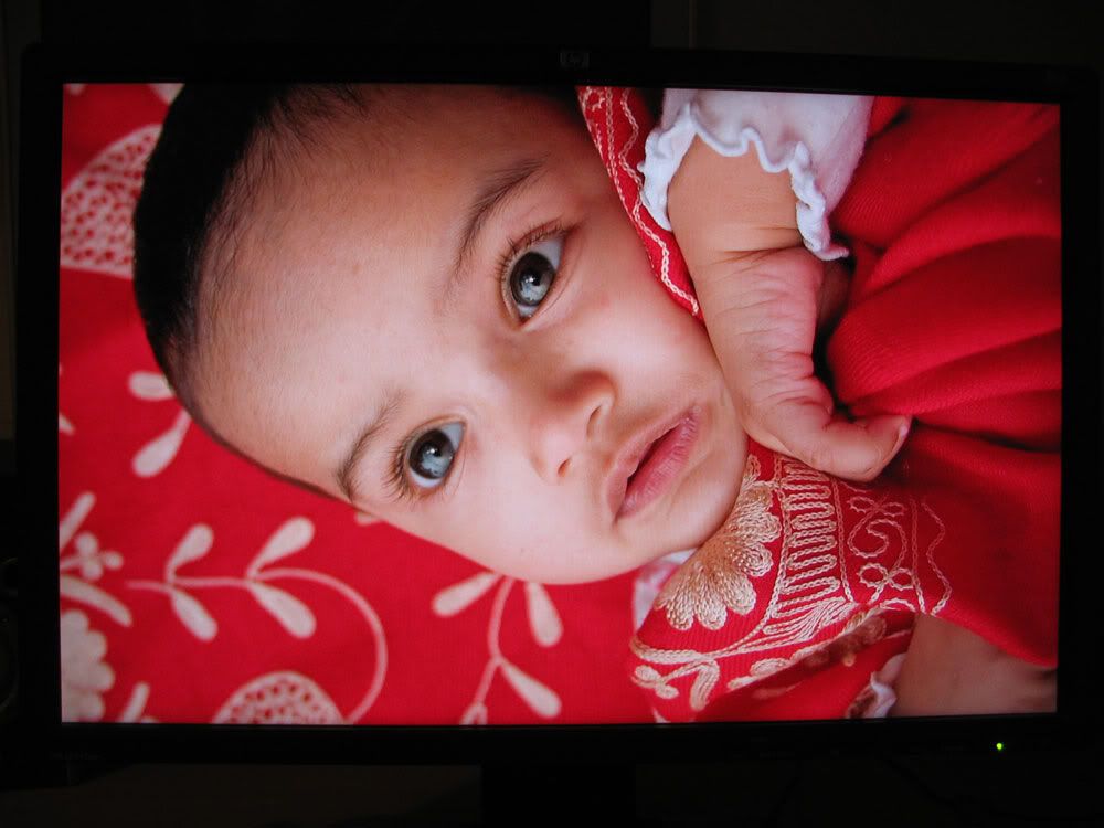
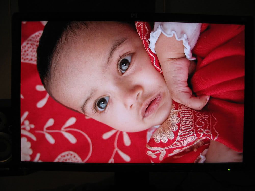
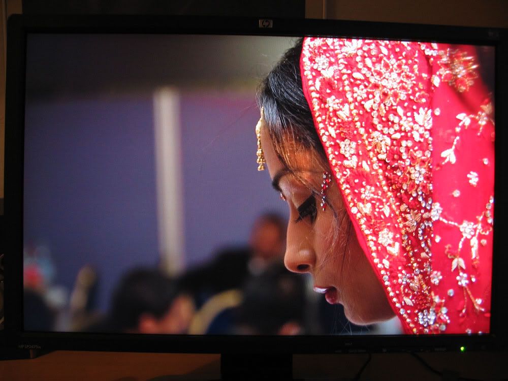
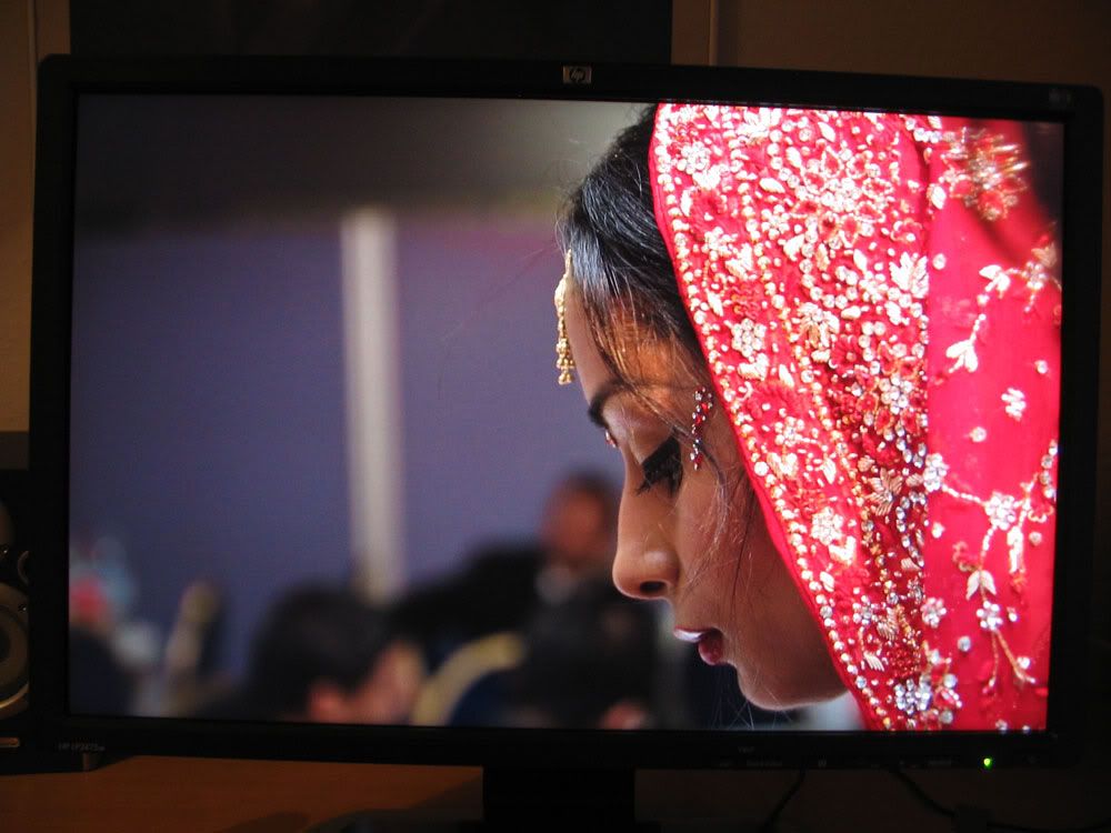
The panel displays a definite left-right inconsistency, as mentioned in the H thread - approximately a third of the screen on the right-hand side is slightly darker than the rest, getting worse as you approach the edge. This is noticeable on any lightish background of a single continuous colour, although sometimes just barely. On all-white backgrounds or shades of grey, there’s also a visible colour difference - the dimmer right-hand area has a faint purplish cast, the rest is yellowish. Again, the effect is quite subtle, and may not bother some people at all, or even legitimately be classed as a “fault” in the context of a consumer-grade LCD panel. However, it was the very first thing I noticed after I plugged in the monitor and fired up Outlook full screen - having seen it the once, I can’t stop myself from constantly looking for it and, needless to say, I keep finding it (web forum pages in a maximised window are a particular source of irritation). I guess it would be a real showstopper for a graphics pro, as calibrating the panel properly in one area would make it hopelessly wrong elsewhere. It does seem to get a little better after the monitor has been on for a while and completely warmed up, but I can’t be sure, as by that time I’ll have been obsessively peering at the screen to the point of seeing things that may or may not actually be there.
Interestingly, I’ve experienced a small amount of “green snow” as described in the Hazro thread (although very minor in comparison), as well as the odd bit of “black snow” on green/blue backgrounds such as the default Vista wallpaper. This seemed to go away completely when I swapped the video card (an ATI HD2600XT) for an nVidia 8500GT, although I didn’t use the nVidia card for long enough to be completely sure. I wonder if it’s at least partly an issue with certain ATI cards, as I believe has been suggested elsewhere.
It's a great shame about the uneven backlight, panel variation or whatever it is, because where this monitor is good, it's very, very good. Maybe I just have unrealistic expectations at this price point, in which case I might just get a cheapo 24" TN panel purely for the desktop workspace, to tide me through until hopefully some better technology comes along at a reasonable cost.


")


")
