HP LP2475w, IPS 24" Official Thread! (Now Available from OcUK)

There won't be any physical flicker because refresh rate does not technically exist on an LCD, on a CRT the phosphors have to be continually relit so the refresh rate is the number of times a second this occurs. With an LCD the pixels only alter when the image changes. The reason you may notice a flicker is that the eyes might be focussing between the text and the colours surrounding them which form the cleartype. I personally notice a bit of green on smaller text.
 
Sadly in the end this might be the reason I am sending it back.
Remember wm51: You can compensate somewhat by tuning cleartype:
http://www.microsoft.com/typography/cleartype/tuner/Step1.aspx

text.jpg
 
Mine arrived today, it's enourmous!

Very impressive build quality & stand adjustments, I think I spotted 2 lazy subpixels earlier but I can't seem to see them now so I'm very happy with it.

I'm still unsure about the colours but I've only had a very quick play with settings so I could do better and think i could live with the wide gamut, skin tones seem to be the worst victims.

I'm not happy with text though. Some of the time it seems fine, but it's not what I'd call sharp, and sometimes I can clearly see colours around it, almost like the DLP rainbow effect. Bit of a bugger for me as I'm I spend a lot of time looking at code.

I'm also getting a bit of eye strain with it, I'm not sure if this is just the sheer size of it or something else, I've got brightness down to 10 and i sit about 60-70cm away.

It almost appears to be flickering very slightly, I'm not sure if this is the refresh rate? I've always seen flicker on crt's below 85hz, but I didn't think LCD's had the same problems, I've never seen lcd flicker before.

With a backlight very low you may see some flickering, that's how you "dim" a CCFL lamp (flashing it on and off very quickly).

Don't notice a problem with text, but did run ClearType tuner (as I always do with a new monitor) so have you tried that? I also look at code all day and haven't noticed any eye-strain yet (touch wood).
 
Thanks guys, I ran the cleartype tuning earlier. None of the choices for text on the last screen seemed particularly good to me, and the examples of fonts were pretty poor, especially the italics, I could see a fair bit of colouring. I'll probably go through all the options and see if I can get it any better.

I didn't think LCD's could flicker, but that's interesting what you say about the backlight, that might explain it.

Anyway, I'll push on for the next few days and hope I get used to it all. Otherwise it's a cheap 20" tn panel until I find something better.
 
ClearType:

It's well documented that ClearType is an imperfect solution to what is basically a flaw in current LCD technology. Specifically results vary depending on the physical properties of the LCD panel in question and the wiring behind the eyes of the user. Details:

http://en.wikipedia.org/wiki/ClearType

For all that, it is better to light a candle than it is to complain about the dark. I suspect the following is already part of the ClearType tuning process but give it a go, FontSmoothingGamma is the setting to change.

http://www.pctipsbox.com/fine-tune-cleartype-settings/

Remember to select Decimal when entering values in the recommended range. I don't know how valid that range is, I did try a value of 100 and I'm currently using a value of 8192 (= 2000 in hexadecimal, I forgot to select decimal :p ) with almost zero fringing on close inspection. You need to reboot for the change to take effect. I'm using XP btw and my initial value was 1000, ymmv under vista.

Does it affect the colour outline ? You bet.
Will it fix your problem ? I don't know, I don't notice the outline at my normal viewing distance.
 
Last edited:
I was thinking a bit about the subpixel structure... If one rotates the monitor and puts it in vertical mode, we are not looking into a V-RGB subpixel layout anymore, but a RGB standard layout.

Could someone try if setting the monitor vertically makes ClearType text better looking? In theory it should because ClearType assumes RGB pixel layout.
 
@ ecat - had a look at the registry entry for the gamma setting and get a different value in vista, default seems to be 0?

@ HiggsBoson - I tried the live cd but ran into problems trying to set the desktop resolution. At default it was 1600x1200 after changing the aspect ratio to 16:9 the desktop wouldn't display correctly appearing several times with a series of missing lines? Any ideas?

@ philjohn - I followed your instruction for implementing the ICC profile using the LUT manager, however when I open up the LUT manager it simply shows the basic line. Is this right because the colours appear unchanged?
 
@ philjohn - I followed your instruction for implementing the ICC profile using the LUT manager, however when I open up the LUT manager it simply shows the basic line. Is this right because the colours appear unchanged?

I think it loads the default from the graphics card if you open it up again - as I said before, the change is so subtle that you might miss it when you log in (I normally do, but it definitely happs, I put in a deliberately crazy ICC profile to test).

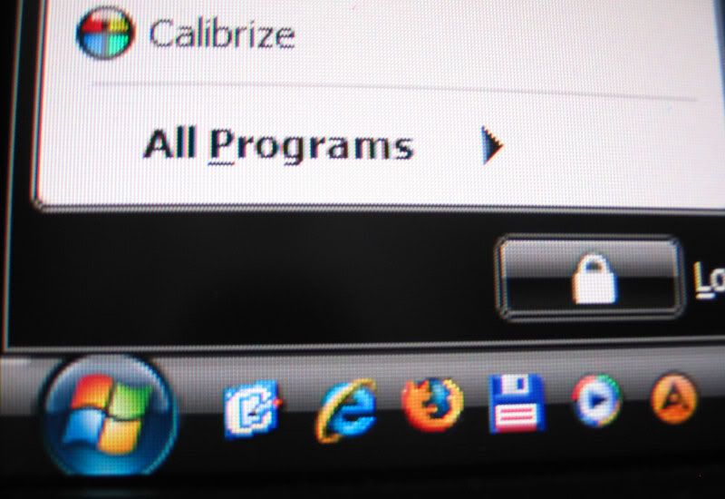
As for the text issue, I really have no problems on mine that I can see, and have the following (bad, from point-and-shoot compact) photo to show how my Vista start menu looks:

text.png
 
Ok thanks for clarifying that one philjohn and your text looks fine to me too, I think I am beginning to adjust to it now. But comparing it to nightrhyme's above your characters certainly look more defined and clear whereas his appear to have more 'colour' around them.

@ Higgs - I had quick test with what you mentioned and personally noticed no difference betwen landscape and portrait mode. I think the problem lies with cleartype on a wide gamut monitor, its just brining out those edges colours a little too much. Wide gamut seems to be the main issue I can find atm. As mentioned skin tones do suffer and playing bioshock is a little odd but colours in grid are really saturated.
 
Last edited:
@ Higgs - I had quick test with what you mentioned and personally noticed no difference betwen landscape and portrait mode. I think the problem lies with cleartype on a wide gamut monitor, its just brining out those edges colours a little too much. Wide gamut seems to be the main issue I can find atm. As mentioned skin tones do suffer and playing bioshock is a little odd but colours in grid are really saturated.

Should have mentioned, you'll need to re-apply (load lut from file) after playing games as they often wipe out custom graphics card gamma curves (as does the UAC control in Vista, so I turn that off too).
 
Somewhere, on the internet :rolleyes:, I came across a LUT manager that claimed it could protect against the table overwrite from games, indeed its main feature was 'Use your colour profile in games'. I'll see if I can dig it out tonight, maybe useful to some.
 
@ HiggsBoson - I tried the live cd but ran into problems trying to set the desktop resolution. At default it was 1600x1200 after changing the aspect ratio to 16:9 the desktop wouldn't display correctly appearing several times with a series of missing lines? Any ideas?.

I've heard that before but haven't found it myself. It looks like the Live CD has problems detecting widescreen displays out of the box with some hardware configurations. You could set up a correct xorg.conf manually and then restart the X server. It's difficult to tell what is going on without looking at log files.

@ Higgs - I had quick test with what you mentioned and personally noticed no difference betwen landscape and portrait mode. I think the problem lies with cleartype on a wide gamut monitor, its just brining out those edges colours a little too much. Wide gamut seems to be the main issue I can find atm. As mentioned skin tones do suffer and playing bioshock is a little odd but colours in grid are really saturated.

Thanks for trying. I made a mistake though, we transform a landscape VRGB into a portrait BGR, not RGB as I said previously, so the right test will invole setting ClearType in BGR mode (with the ClearType teaking utility, I guess). Anyway, if there was no big difference I agree with you that Wide Gamut is the suspect.

Why is it so difficult to buy a monitor nowadays? :(
 
I think it loads the default from the graphics card if you open it up again - as I said before, the change is so subtle that you might miss it when you log in (I normally do, but it definitely happs, I put in a deliberately crazy ICC profile to test).

As for the text issue, I really have no problems on mine that I can see, and have the following (bad, from point-and-shoot compact) photo to show how my Vista start menu looks:

text.png

That looks fine.

Just out of interest what are your RGB/Brightness/Contrast settings?

Have you done anything to reduce saturation at all? (ie ati control panel)

I've just installed the cleartype xp powertoy (works fine on vista btw) and reduced the contrast setting to 1.5/1.6 to make the cleartype effect less bright. It certainly improves text a lot, the halos are not really visible at all, but it does reduce the cleartype smoothing somewhat (as you'd expect), but it's definately less bad.

It still doesn't look as good as the £130 asus lcd I got from ocuk for work the other week.
 
That looks fine.

Just out of interest what are your RGB/Brightness/Contrast settings?

Settings :-
Brightness: 12
Contrast: 82
R, G, B: 246, 238, 226

Have you done anything to reduce saturation at all? (ie ati control panel)

Nope, running an nVidia card so no saturation control.

I've just installed the cleartype xp powertoy (works fine on vista btw)

That's good to know, got a big ugly "This Application has a known compatibility problem with Windows Vista" dialogue. :eek:
 
I didn't try the cleartype xp toy because I thought that it didn't work under vista but I went ahead and followed ecat's link [thanks ecat] and can confirm making an adjustment of the gamma value in the registry made a big difference to the text. Where before I could see faint green/red fringes on the text particularly black text on white backgrounds and characters with more 'curviness' such as 0, I now can make out none. Under vista64 the default was 0 so I switched it to 2000 decimal btw for those interested.

btw any luck with that LUT manager ecat?
 
Back
Top Bottom