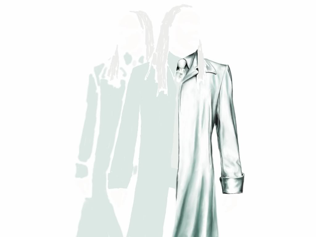
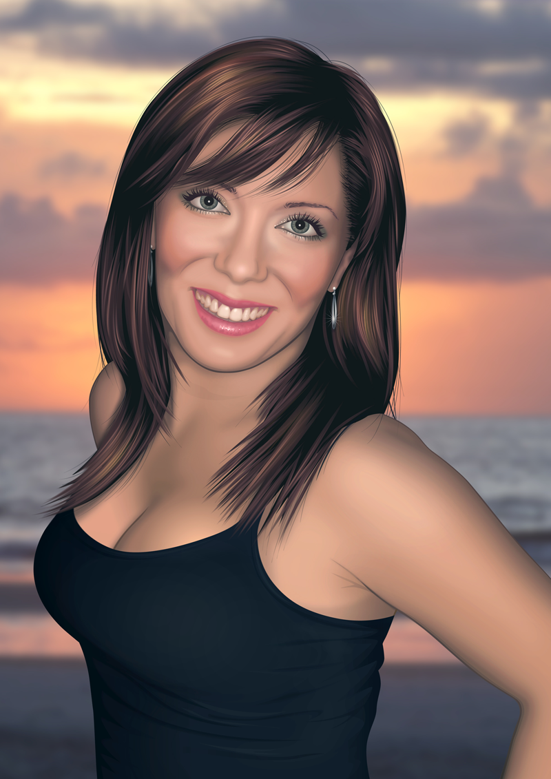
The process of the above images are digital. That's not always the case, sometimes I'll sketch an outline and scan it, generally depends where the references materials are coming from. For rendering, I prefer digital because of the flexibility but as you can see I'm still obsessed with making things look traditional.
Layer your paint and strokes
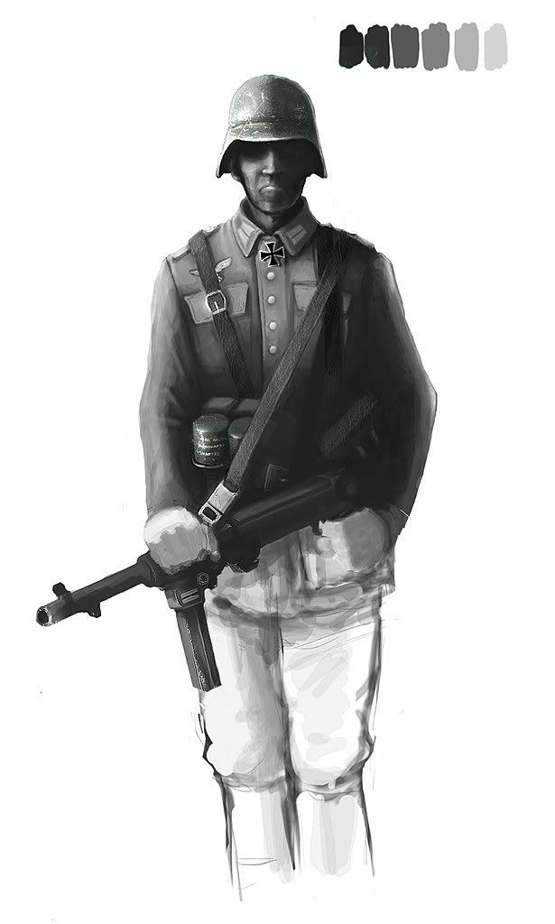
I use the same process across both B&W sketches and coloured paintings. A sort of paint layering effect. I use rough, textured brush work in an often varied selection of colours(before I've chosen a final palette). If you look carefully you can see the under painting and different colours showing through, this is intentional. To create a relatively impressionistic style. That and I prefer a textured, rough look as opposed to a fully digital smooth feel. I like the fact that people often have to look twice to tell if it's digital.
So, I start off with bold, textured strokes when blocking in shapes and values and refine with smaller more accurate brushes.
As for my palette. I often choose dull colours, this is subconsciously intentional because my mind always goes for the look of oils and traditional paints. Bright, bold colours look too digital for me. I have my swatches palette(Photoshop) customised to suit this.
My Brushes
If anyone wants the brush set I use, I'm more than happy to share. But, Photoshop already has a set of textured brushes, which I'd more than happily get use out of. It's more about how you layer the strokes and colour.
Vary your though process
My process changes. Recently I've been using line drawings but I'm a great believer in a more abstract approach when you begin, letting something form from shapes, images and colours. Here's a better video explanation:
LINK - http://vimeo.com/927695 - This chap has a brush set, too which I've used but didn't like because it's essentially a large library. I like a small set as I only ever use 4 brushes and usually always 2 different ones per painting.
Breakdown
Here's 3 different stages of a sketch I already have uploaded, I'll be sure to upload more stages as the thread goes on, though.
Line drawing comes first. After that I start the canvas at around 30% grey and block in values using a slightly textured charcoal style brush. The values are rather dramatic but that'll be smoothed out later.

It's important for the texture during this stage and the previous to show through later on. It's now cropped to a decent focus and the smoothing process has already begun. After the charcoal brush has been used for values, I head onto a hard edged round brush set at 10-15% opacity with pen pressure settings adjusted to smooth things out.

The cleaning up process continues, always referring to the reference to reach the appropriate values. The shadowed areas of the face have now been corrected to a reasonable standard.

Hope this is okay. I'm no expect particularly with terminology, I'm only learning like everyone else but I am fortunate enough to know Photoshop inside out which makes things a little easier and the process much quicker.
Get the line drawings, values and lighting sorted and everything else will come after that - Which I'm still learning!
Layer your paint and strokes
I use the same process across both B&W sketches and coloured paintings. A sort of paint layering effect. I use rough, textured brush work in an often varied selection of colours(before I've chosen a final palette). If you look carefully you can see the under painting and different colours showing through, this is intentional. To create a relatively impressionistic style. That and I prefer a textured, rough look as opposed to a fully digital smooth feel. I like the fact that people often have to look twice to tell if it's digital.
So, I start off with bold, textured strokes when blocking in shapes and values and refine with smaller more accurate brushes.
As for my palette. I often choose dull colours, this is subconsciously intentional because my mind always goes for the look of oils and traditional paints. Bright, bold colours look too digital for me. I have my swatches palette(Photoshop) customised to suit this.
My Brushes
If anyone wants the brush set I use, I'm more than happy to share. But, Photoshop already has a set of textured brushes, which I'd more than happily get use out of. It's more about how you layer the strokes and colour.
Vary your though process
My process changes. Recently I've been using line drawings but I'm a great believer in a more abstract approach when you begin, letting something form from shapes, images and colours. Here's a better video explanation:
LINK - http://vimeo.com/927695 - This chap has a brush set, too which I've used but didn't like because it's essentially a large library. I like a small set as I only ever use 4 brushes and usually always 2 different ones per painting.
Breakdown
Here's 3 different stages of a sketch I already have uploaded, I'll be sure to upload more stages as the thread goes on, though.
Line drawing comes first. After that I start the canvas at around 30% grey and block in values using a slightly textured charcoal style brush. The values are rather dramatic but that'll be smoothed out later.
It's important for the texture during this stage and the previous to show through later on. It's now cropped to a decent focus and the smoothing process has already begun. After the charcoal brush has been used for values, I head onto a hard edged round brush set at 10-15% opacity with pen pressure settings adjusted to smooth things out.
The cleaning up process continues, always referring to the reference to reach the appropriate values. The shadowed areas of the face have now been corrected to a reasonable standard.
Hope this is okay. I'm no expect particularly with terminology, I'm only learning like everyone else but I am fortunate enough to know Photoshop inside out which makes things a little easier and the process much quicker.
Get the line drawings, values and lighting sorted and everything else will come after that - Which I'm still learning!
Last edited:


")

")