Show What You're Working On

Just to clarify: you are only going to allow users to answer 10 questions per day, max?

That's correct, it's all controlled by the web services. Ten random questions are picked per day from my database of questions and presented to the user. This means it's a level playing field for all, i.e. the same 10 questions for all users, which makes the scores tables more relevant. It also increases the longevity of the quiz.
 
Are 10 questions enough?
What if you have a lite version, where the number of question is capped to 10 questions per day.
And a paid for version where there is no cap.

This way, if you want to go high up on the leaderboard (this is the incentive), you need to buy the full version.
 
The 10 questions are fine, it's the type of app that you can come back to each day for a couple of minutes, do the quiz and maybe revisit to see where you are in the score tables. My testers like it but I'll have to wait and see how the general populous view it.

Having said that you have made a good point about a lite version being limited to a number of questions and the paid one allowing more questions to be answered. That sounds like it would work.
 
LoLaroo I'm still working on our website, Its taken me so long we've even built stuff since I started it but its sooooooooooo close to being finished now, just a bit more content.

All ideas / feedback very much welcome.

http://www.planaarc.co.uk
 
@LOAM

There seem to be a few pages where the css doesn't look finished. It may be intentional but there are a couple of bits that look a bit dodge.

LinkedIn and twitter buttons are not aligned
Contact us page line heights and general spacing
Project pages slide numbers are top left of their box, not sure if intentional.
Black text on the images is lost most of the time.

Looking nice though.
 
Thanks chaps, ill clean the css file up next.

I'm working on the project thumbs as we speak :) might pop a little border round the thumbnail buttons. The javascript is sadly not mine (this is the first site I've ever made) its one that's publicly available that I managed to butcher :P

There's an image switched off as well in the top right (RIBA crest that we cant display until our chartered status is confirmed) that will help balance it.
 
Last edited:
I've been working on my game engine still and fixing things and stuff for my dissertation. Turns out my terrain was massively destroying performance. So as I was working with tessellation, why not dump the terrain to really low quality, and boost it's quality back up to the higher one on the fly, but only in the area close to you? My terrain went from over a million verts to just 16K and performance is back to acceptable conditions ^_^.

(Old terrain)
http://i.imgur.com/eTOwF.jpg

(New terrain)
http://i.imgur.com/GPucQ.jpg

It does look like in the old terrain that tessellation is turned up so high that it may as well be solid xD, but they're both the same amounts of tessellation. It's just that in the old terrain, the verts are much more packed and closer together, so that when the tesselated verts come along, they have to be placed inside this small space. In the new terrain they're just more spread out :). And it's not perfect yet, there's still bugs D: And the meshes etc may or may not be from a particular game. *Cough*
 
Last edited:
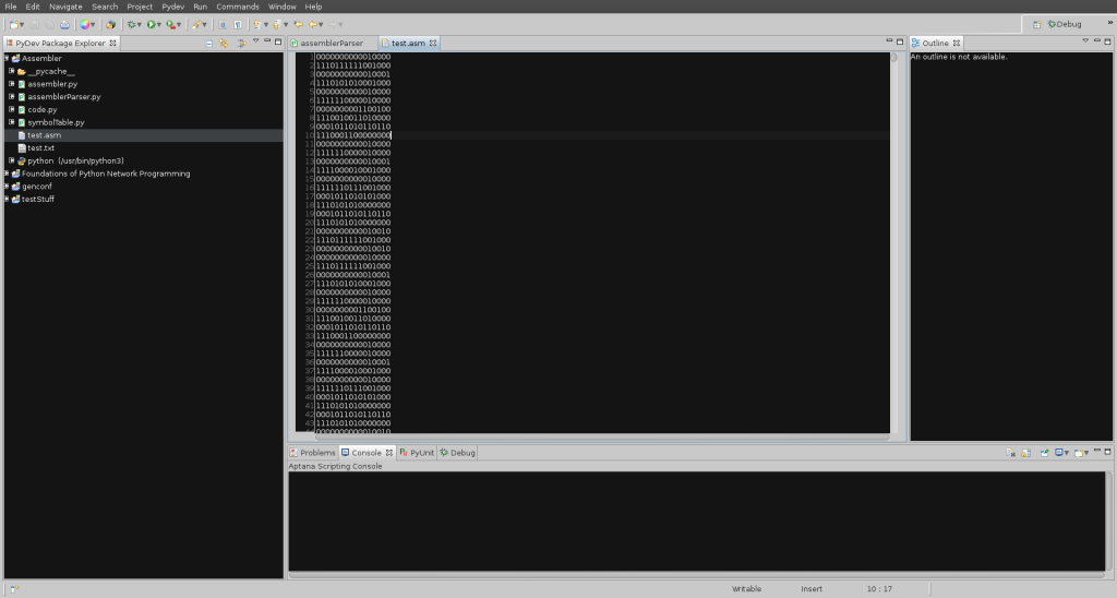
Here is the output from the HACK assembler I made the other night. :)

2012-04-19-204122_1920x1028_scrot.png


Zhokel, that looks very nice- I am just starting OpenGL programming. Are you using OpenGL or DirectX?
 
Zhokel, that looks very nice- I am just starting OpenGL programming. Are you using OpenGL or DirectX?

Thank you :). It's DirectX 11. I was going to also have OpenGL in it but I just did not have the time, maybe after Uni is all done :D.
 
Hey folks, I finally put Responsify live!

Please check it out and let me know what you think.

http://responsify.it

Gonna blog about it in the coming weeks, look forward to one about the Webkit percentage rounding bug!
 
Last edited:
Not much been posted recently so here's something I have been working on:

HD version on the actual YT. Mostly AE for composition, bit of Blender, a lot of PS, a dash of Ai and some Audition.

 
Thanks chaps, ill clean the css file up next.

I'm working on the project thumbs as we speak :) might pop a little border round the thumbnail buttons. The javascript is sadly not mine (this is the first site I've ever made) its one that's publicly available that I managed to butcher :P

There's an image switched off as well in the top right (RIBA crest that we cant display until our chartered status is confirmed) that will help balance it.

On the contact page, I'd maybe look at replacing the large pA. with a Google maps or something?
 
Back
Top Bottom