You are using an out of date browser. It may not display this or other websites correctly.
You should upgrade or use an alternative browser.
You should upgrade or use an alternative browser.
Terrible Jaguar re-brand
- Thread starter Stu999
- Start date
More options
Thread starter's postsSoldato
- Joined
- 19 Oct 2002
- Posts
- 17,744
- Location
- Shakespeare’s County
Aspiring to rival the taycan doesn't seem a high enough bar ... the market gave it's verdict on that - Spectre rival ?
Huh, Which market they had to ramp up Taycan production to cope with the demand, dont confuse used market with new!
Soldato
- Joined
- 23 May 2006
- Posts
- 7,985
I dont mean to jump on the bandwagon but.................. (jumps on the band wagon) its bloody awful.Jaguar have been messing around with their logo and so on and have come up with the monstrosities in this link:

Official: The four new design elements that will reinvent Jaguar | Autocar
Four new design elements are “a reimagining that recaptures the essence of Jaguar"www.autocar.co.uk

the JR logo, the mixed up upper/lower case, the font........ and then that advert with the bright colours - its like a clothes advert or something advertising a new OLED TV.
but the worst thing of it all is that Jaguar already have an iconic brand which has stood the test of time, the logo, the leaping cat and the growler all are great.. Perhaps the cars needed to change (though that cancelled EV looked pretty sweet to me) but i just do not think the logo or the badge needed to change.
my view on the cars is that there was nothing wrong with them either, just the customer experience and maybe the reliability needed to improve - but those things are going to have to be even better still if they are expecting to sell all their cars for a minimum of 6 figures.
maybe the cars will be amazing, and ultimately that is what matters, but to me the whole brand and image has taken a massive step backwards from something which was genuinely pretty cool.
Its sad imo
that covered up car out in testing... i really hope they are hiding the shape of it under the camouflage as well because whilst beauty is in the eye of the beholder and all that, the shape looks awful to me.
Last edited:
This really is a god awful ad, really confusing to whom they are targeting with this.Looks like an advert for a Vivo or Honor phone.

Soldato
- Joined
- 23 May 2006
- Posts
- 7,985
Gerald Ratner thought all good publicity was good publicity.... he was proven wrong. I really hope Jaguar do not go the same wayAbysmal as it is. it's got the internet talking I suppose which is more than any of their cars have done for the last 10 years or so.
IF for no other reason than Farage and Musk will claim they called it!.
Last edited:
Have you
To be fair he said his jewellery was total crap and and that some of it was cheaper than a prawn sandwich, hardly the same thing going on here.
Gerald Ratner thought all good publicity was good publicity.... he was proven wrong. I really hope Jaguar do not go the same way
To be fair he said his jewellery was total crap and and that some of it was cheaper than a prawn sandwich, hardly the same thing going on here.
Christ on a bike! What on earth is that supposed to be?I think that looks Hideous, Worse than the i7.
Don't worry guys, Jaaag is well and truly saved

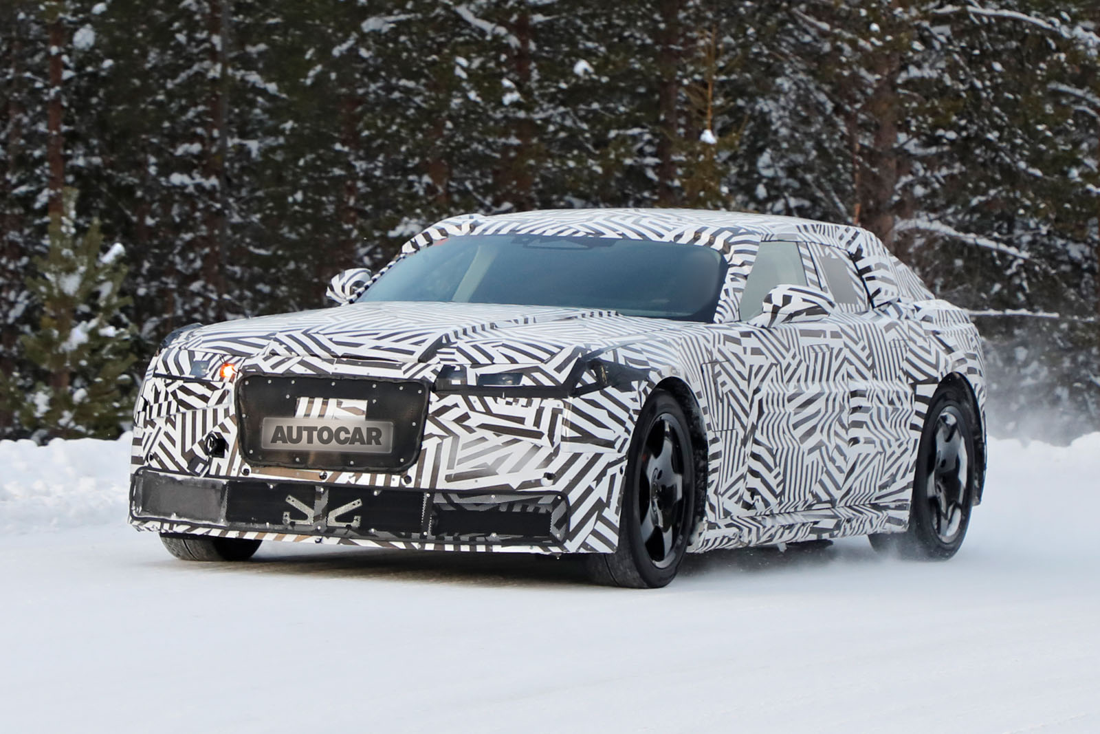
New pictures of Jaguar's super-GT show fresh details ahead of reveal later this year | Autocar
Prototype for Jaguar's £100k Taycan rival confirms no rear window and shows off unique design elementswww.autocar.co.uk
Chrysler 300C Touring
Fair point.Not sure some people realise that camo is more than just a wrap.
I've been at Millbrook a few times (with Audi) and seen some heavily disguised motors, but none turned out that much different.
It has that vibe, and look how well that sold over here.Chrysler 300C Touring
Soldato
- Joined
- 19 Oct 2010
- Posts
- 2,957
These guys know
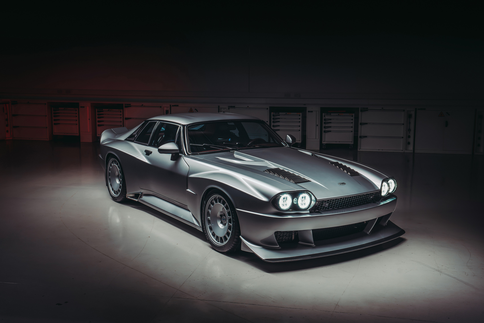
 twrperformance.co.uk

Heritage | TWR | Tom Walkinshaw Racing | TWR Racing
Tom Walkinshaw Racing was born out of a desire to be better, and to win. A TWR car name with a perfect blend of power, handling and dynamics.
 twrperformance.co.uk
Do you think this is some form of corporate espionage? I’m starting to wonder if malicious nation states or competitors line the Chinese/BYD have infiltrated the marketing/diversity departments in British companies.
Presumably with the intention of running those companies into the ground to eliminate competition or to allow them to be bought cheaply as part of a takeover strategy!
I can’t think of what else could explain this kind of behaviour!
Presumably with the intention of running those companies into the ground to eliminate competition or to allow them to be bought cheaply as part of a takeover strategy!
I can’t think of what else could explain this kind of behaviour!
Last edited:
Very possibly, just look at Ubisoft and Tencent.
Not to mention EA/Bioware and all the other Sweet Baby infested game studios.
Soldato
- Joined
- 23 May 2006
- Posts
- 7,985
I am really hoping that is the caseNot sure some people realise that camo is more than just a wrap.
Soldato
- Joined
- 19 Oct 2002
- Posts
- 17,744
- Location
- Shakespeare’s County
It’s literally got chunks of foam glued to it!
taycans haven't been immune to the ev depreciation of most evs sold through fleet bik bargains deals, just a commodity not an aspirational brandHuh, Which market they had to ramp up Taycan production to cope with the demand, dont confuse used market with new!
long term that erodes the brand desirability - fool me once.
maybe for GenZ if they grow up in a world of ev's without experience of luddite ICE they won't miss anything though.

