Associate
- Joined
- 24 Dec 2010
- Posts
- 209
- Location
- Surrey
The JPG has now gone up... you will be able to see the difference that the HDR made to the image.
No.2 is awesome...

Cheers, I like both of those a lot, not actually quite the effect I had in mind as I was shooting quickly in manual but I think I prefer it to what I had in mind now, my competition shot for last month is from the same set...
I struggle for a favourite between them and I was leaning towards the one I posted here but I've got more positive feedback on this in the end so I used it instead...
")

")

The JPG has now gone up... you will be able to see the difference that the HDR made to the image.
Cheers, I like both of those a lot, not actually quite the effect I had in mind as I was shooting quickly in manual but I think I prefer it to what I had in mind now, my competition shot for last month is from the same set...
I struggle for a favourite between them and I was leaning towards the one I posted here but I've got more positive feedback on this in the end so I used it instead...
 , old age sucks!


Great processing, especially bringing out the details and textures. Was it an HDR composed of multiple shots (what software did you use?) or other artificial manner?
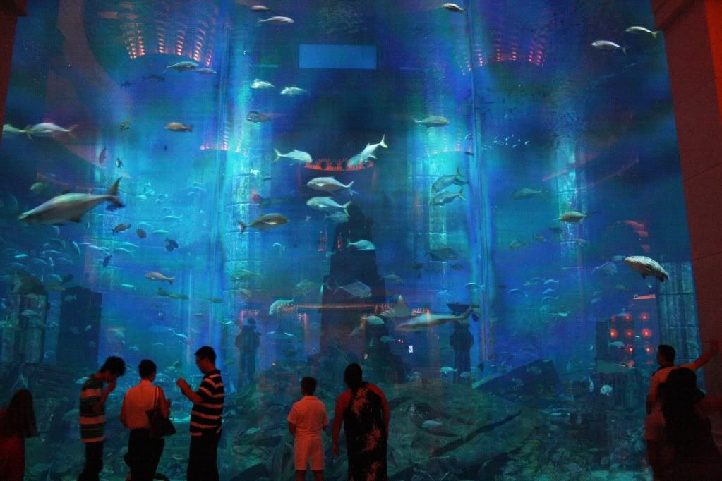
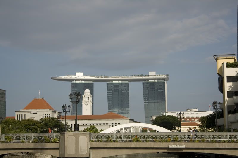
The Atlantis is a fantastic hotel complex, we were in it back in August on the way back from Singapore, the aquarium blew me away, the sheer size and the fact so many restaurants have windows into it.Took a few photos tonight on my Nex-5, all unprocessed apart from being cropped and straightened. all in auto, all with a tripod except the last two.
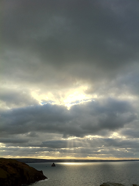
Critique welcome... how can i make the sky really black like some of you guys do?

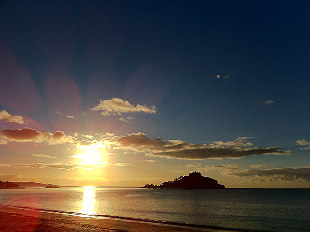
There's some really nice stuff on show there and I find your entry into the past month's competition equally as compelling.A few from a trip to the beach on boxing day...loads left to process from the holiday season...
Be gentle please!
Just 'trying' to get into photography slowly, but more so playing around in Lightroom and Photomatix. Never really used them before.
This is probably awful in colours, saturation and what have you but looks good to me and the ol' untrained eye
Any tips?
It looks good. i would take the image and perhaps add some contrast into it as the HDR has taken a lot away from the shadows. you might also want to have a play with the light and shadow curve if lightroom has one to get a move even image. but It actually looks really great. amazing detail! i Love the colours what are in there! lovely greens and blues and that moody sky. you have done well!
I would say. bump the contrast up to between +80 and +100 and lower the saturation down to between -15 and-30
I'll look into that later tonight. All a learning curve.There's some really nice stuff on show there and I find your entry into the past month's competition equally as compelling.
I don't think I've come across your work in here before but I've always found your technical knowledge and experience a constant source of interest, so it's nice to see that your photography itself is equally as rich and varied.