Associate
- Joined
- 24 Jul 2009
- Posts
- 2,337
- Location
- -
Ordered some more zigbee led strips to go behind TV for the sole purpose of them changing colour based on football scores and F1 flags during races.
These. I have them in the Kitchen already so I know they work with Zigbee2MQTT directly connected in HA. https://www.aliexpress.com/item/100...o.order_list.order_list_main.5.7ab51802b3oc9PWhich strips do you go for @The1nonly1 ?
Ooh the flags in F1 races piques my interest. Would only be worthwhile to me if the delay after the actual flag event was less than a second or two. I was looking at this but I can't find information on pricing at the moment.Ordered some more zigbee led strips to go behind TV for the sole purpose of them changing colour based on football scores and F1 flags during races.
I'm using this for HACS https://github.com/Nicxe/f1_sensorOoh the flags in F1 races piques my interest. Would only be worthwhile to me if the delay after the actual flag event was less than a second or two. I was looking at this but I can't find information on pricing at the moment.
Where are you planning on pulling your flag data from?
Ah that's cool. I've been looking around at various API solutions for a while now - it never occurred to me to just check HACS!I'm using this for HACS https://github.com/Nicxe/f1_sensor
You can input your own delay based on the service you're using to watch F1. I'll have it up and running for the next race.

 shop.linknlink.com

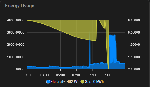
Thanks for the link. Still cannot get it to invert underneath the electricity, as it is now treated as a separate yaxis. Perhaps it can't be done in the way I want it. Hohum.You need to add another y-axis that's inverted, then it can have its own scale I believe.

GitHub - RomRider/apexcharts-card: A Lovelace card to display advanced graphs and charts based on ApexChartsJS for Home Assistant
A Lovelace card to display advanced graphs and charts based on ApexChartsJS for Home Assistant - RomRider/apexcharts-cardgithub.com

type: custom:apexcharts-card
update_interval: 2s
header:
  show: true
  title: Energy Usage
graph_span: 12h
apex_config:
  chart:
    height: 250px
    width: 500px
  grid:
    show: true
    strokeDashArray: 0
    borderColor: "#444444"
    position: back
  xaxis:
    lines:
      show: true
  yaxis:
    - show: true
      title:
        text: "Electricity"
      forceNiceScale: true
    - show: true
      opposite: true
      title:
        text: "Gas"
      forceNiceScale: true
      reversed: true  # <-- this inverts the y-axis itself
series:
  - entity: sensor.electricity
    color: 0388fc
    name: Electricity
    yaxis_id: 0   # Use first y-axis
  - entity: sensor.gas
    color: c2c43f
    name: Gas
    yaxis_id: 1   # Use second (inverted) y-axis
all_series_config:
  stroke_width: 2
type: areaThe yaml is incorrect, Quite a bit of what it spat out is in the wrong sections. BUT I did already try a variation on this. It produces this.Hmm ok.
Give the below a try. No idea if it'll work, it's what Chat GPT spat out
YAML:type: custom:apexcharts-card update_interval: 2s header: show: true title: Energy Usage graph_span: 12h apex_config: chart: height: 250px width: 500px grid: show: true strokeDashArray: 0 borderColor: "#444444" position: back xaxis: lines: show: true yaxis: - show: true title: text: "Electricity" forceNiceScale: true - show: true opposite: true title: text: "Gas" forceNiceScale: true reversed: true # <-- this inverts the y-axis itself series: - entity: sensor.electricity color: 0388fc name: Electricity yaxis_id: 0 # Use first y-axis - entity: sensor.gas color: c2c43f name: Gas yaxis_id: 1 # Use second (inverted) y-axis all_series_config: stroke_width: 2 type: area

What about making a helper through the UI which inverts the gas sensor value?This might be the best place for this.
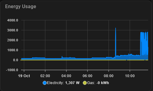
I'm struggling to understand how to modify an apexchart y-axis unit size for a series entity which is inverted.
This is a simple energy usage chart, showing both electricity and gas.

Is there a way to change the y-axis scale for the inverted gas usage? I suspect I need to modify the following section but I'll be damned if I can work out how.
...
Any pointers?
Cheers!
I'll give it a whirl but I may just settle for separate graphs.What about making a helper through the UI which inverts the gas sensor value?
It should be fairly straightforward - create a template sensor called sensor.gas_invert or similar and add a bit of yaml along the lines of {{ states(‘sensor.gas’) | float*(-1) }}I'll give it a whirl but I may just settle for separate graphs.
This and multiply it by 1000 and it'll fit with the electricity scale.What about making a helper through the UI which inverts the gas sensor value?
It should be fairly straightforward - create a template sensor called sensor.gas_invert or similar and add a bit of yaml along the lines of {{ states(‘sensor.gas’) | float*(-1) }}
Thanks. I'm still tinkering and finding my feet with this. Cheers.This and multiply it by 1000 and it'll fit with the electricity scale.


