it was completely unusable just like this update anyone who first used the last update on mobile will have remembered.
It's hardly "completely unusable"
it was completely unusable just like this update anyone who first used the last update on mobile will have remembered.
Turn AdBlock off on the external site you're coming from, in this case your email provider (Gmail/Hotmail etc, whatever applies to you)I get this error pretty much every time I click a link from an email.
I have to refresh the page
Are you using Chrome with uBlock Origin by any chance?I get this error pretty much every time I click a link from an email.
I have to refresh the page

Meant to elaborate that the old functionality worked where if you looked in a thread and went back, it would correctly log the thread as now having been read. The new version doesn’t.I’m all good with the icons.
But on the mobile version at least, if you go to the newest messages then go ‘Back’, it won’t update the mail icon to ‘Read’. It will be as if you’ve not looked in the thread yet and show as ‘unread/new messages’.
Which is a step backwards on the old design. Is it a bug or intended?
It would never look exactly like the previous version, but we're looking at all options at the moment.

Well that will never happen I'm afraid!t's a shame the new software, great as it maybe, can't exactly replicate the look of the '02-ish era vBulletin software before it
Is there the prospect of Watched Threads functioning exactly like it did before? Not a huge issue as we have filters, but it was better previously IMO. Might be an easy adjustment?
On the old forums the icons were yellow for threads withe unread posts and white-ish for read. At the moment you can't really differentiate them easily, on mobile at least.
rp2000

This is exactly what we're working on.I know the icons are very much work in progress, but I've noticed it's harder see threads that I've viewed and haven't viewed.
For example, previously the envelope icon in the thread list would turn grey once I'd read a thread. But now it seems to be white/cream all the time. Either that, or I genuinely can't tell the difference between whatever two colours are currently being used.
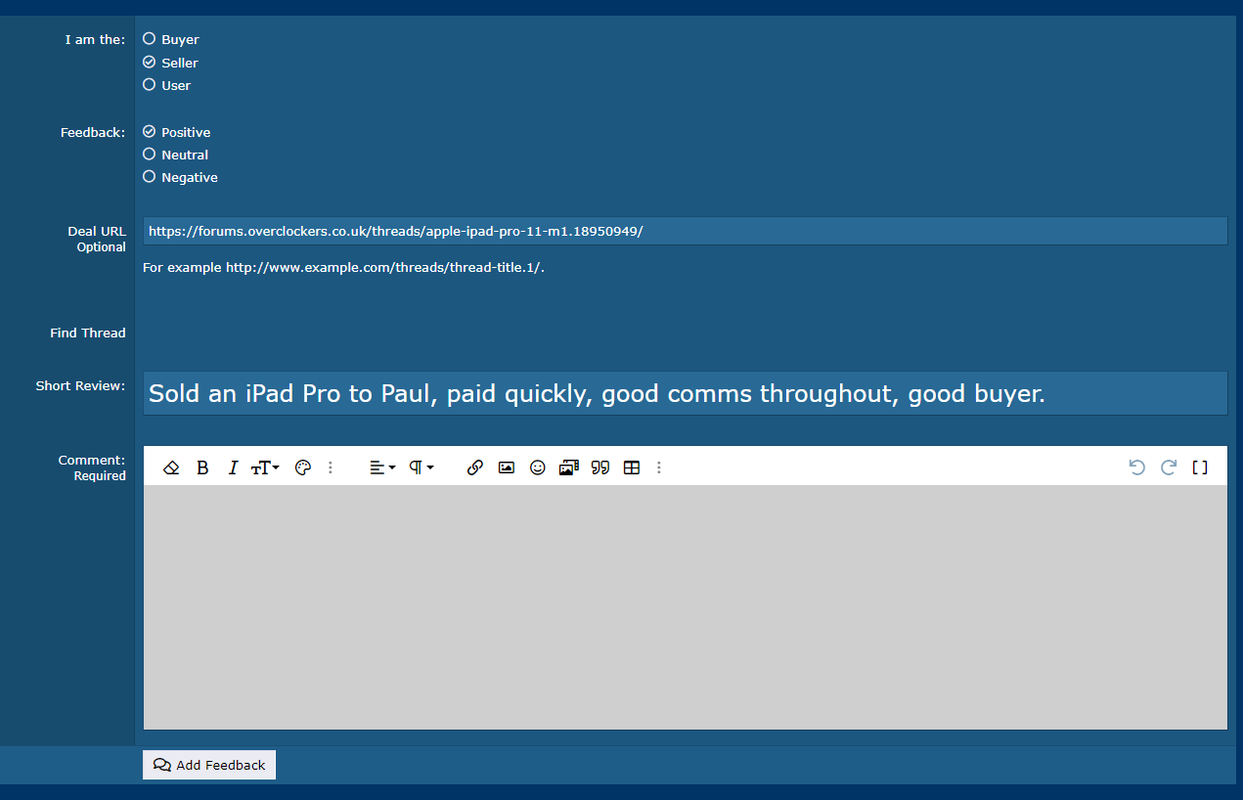
Short Review: Good comms, good buyerRegarding MM, I'm still a little confused on how we add feedback, you are currently required to fill both the 'Short review' and the 'Comments box',
I'll give you an example,

As you can see I've filled the short review box, but I'm also forced to add a comment to, so what am I supposed to put? copy paste the short review in there?
FFS we know!!! New posts are still being looked at! Maybe I should do a massive announcement to stop people complaining!The new posts envelope doesn't light up yellow anymore?
Will the announcement be yellow?FFS we know!!! New posts are still being looked at! Maybe I should do a massive announcement to stop people complaining!
Will the announcement be yellow?

