

mrdbristol said:Why are you confused by my statement.
I gave an honest opinion , which is of more use than just saying " it's alright"
I receive , and digest , criticism from which i try and learn from.
Mark
is he alllways mardy


mrdbristol said:Why are you confused by my statement.
I gave an honest opinion , which is of more use than just saying " it's alright"
I receive , and digest , criticism from which i try and learn from.
Mark
Smile or not, that rolleyes says it to me. I think mrdbristol actually offered some decent advice, quite a lot of people get by on comments like 'well done' and 'good effort' but when they really could be told what to improve on, and how to alter their effort for a better style, constructive criticism, it's great to learn.ChoÞÞer said:is he alllways mardy

")

Ooo..do me..do me!Nimzicki said:Just being honest and giving critiques? Id much rather people criticised my work than went "oohh thats pretty" As nice as compliments are, they dont help you to improve...and there is always room for improvement
The linework shows that there is no confidence in the drawing, its too scratchy, make it one flowing line and it will look a thousand times better. Vary line width to make certain areas pop, finer lines for smaller details, slightly thicker for main outlines etc.
Dont be afraid to use a ruler btw, its a technical drawing, even michaelangelo couldn't draw a straight line freehand
")
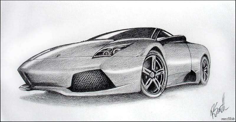


Well, i actually took a photo of the drawing.. so the poor contrast could be attributed to that. The actual darker shaded areas are beginning to go shiny, which is always the point i was told to push to and not let it go any further. I think the paper can be attributed a bit to the problem as well, its artsy farty paper and heavily textured so all the little white bits in the dark are from the low points the pencil doesnt reach, but when a viewer looks at the drawing the eye wont see little white dots, instead it just mixes it with the dark giving the impression of a lighter tone. But as i said, i am going over it again, and removing some of these light spots to push the tones further.Nimzicki said:While am at it then, gord - I dont know if its the quality of the scan or because you havent finished the drawing yet but you would benefit from pushing the contrast in your drawing. Right now you have a lot of mid-tones going on, dont be afraid to push it further, really darken the shaded areas and bring out the highlights, especially when dealing with a nice shiney object such as a lambo
Yeah it was a HDRI script/setup rendered through Brazil, modelling texturing done with 3DS Max (ver 4 or 5 iirc).messiah khan said:Great work there GSXRMovistar, really nice lighting. You using HDRI?
messiah khan said:This doesn't look too bad does it?

NP. Im glad you like it.R34P3R said:That was great cheers messiah khan


