You are using an out of date browser. It may not display this or other websites correctly.
You should upgrade or use an alternative browser.
You should upgrade or use an alternative browser.
[PIC_THREAD] People, Portraits, Street
- Thread starter Rojin
- Start date
More options
Thread starter's postsSoldato
- Joined
- 8 Aug 2010
- Posts
- 6,453
- Location
- Oxfordshire


Soldato
- Joined
- 6 Nov 2002
- Posts
- 9,880
- Location
- London UK
My brother isSo basically you're saying you're a boring moody wimp?...
 I have a shoot tomorrow with a couple DJs. I hope I don't waste their time.
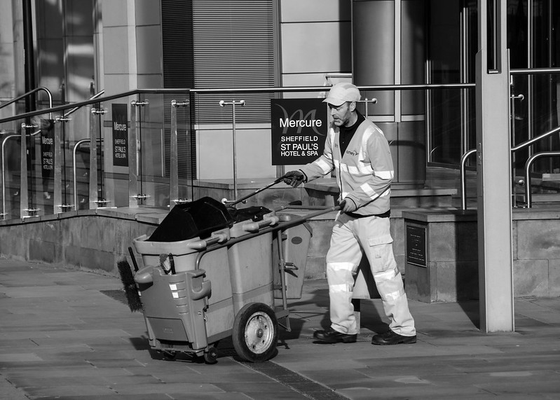
A few from yesterday in Sheffield.

Oh really! by m.ww, on Flickr

Don't watch me eat! by m.ww, on Flickr

Romantic tram lines by m.ww, on Flickr

Oh really! by m.ww, on Flickr

Don't watch me eat! by m.ww, on Flickr

Romantic tram lines by m.ww, on Flickr
Soldato
- Joined
- 8 Aug 2010
- Posts
- 6,453
- Location
- Oxfordshire
I like no.1, something about it reminds me of forums.
No.2 lacks interest for me personally, but 'interest' if very subjective. Composition however is very strong.
Love the composition of no.3, and the subject matter...
No.2 lacks interest for me personally, but 'interest' if very subjective. Composition however is very strong.
Love the composition of no.3, and the subject matter...
I like no.1, something about it reminds me of forums.
No.2 lacks interest for me personally, but 'interest' if very subjective. Composition however is very strong.
Love the composition of no.3, and the subject matter...
Thanks.

I agree that No 2 is definitely the weakest, I only processed it because just after I'd snapped the shot I got the middle finger making it even more of a keeper for me.

Soldato
- Joined
- 6 Nov 2002
- Posts
- 9,880
- Location
- London UK
A few more from yesterday's walk:-

Leah - Belhus Woods 03 by AndyBakerUK, on Flickr

Leah - Belhus Woods 07 by AndyBakerUK, on Flickr

Leah - Belhus Woods 09 by AndyBakerUK, on Flickr

Leah - Belhus Woods 03 by AndyBakerUK, on Flickr

Leah - Belhus Woods 07 by AndyBakerUK, on Flickr

Leah - Belhus Woods 09 by AndyBakerUK, on Flickr
Soldato
- Joined
- 8 Aug 2010
- Posts
- 6,453
- Location
- Oxfordshire
No. 2 is fantastic, though the cross processing is a little strong for me.
Associate
- Joined
- 23 Jun 2005
- Posts
- 2,495
- Location
- On the Edge*


148A1437 by Niall Allen, on Flickr
Oddly, despite me being very unhappy with most of my recent stuff I've had 3 offers of work lately. One for something golf related, one for a band and another for a chef. I decided I suck too much still and passed them onto a professional photographer.
Still I suppose that means there's hope yet

Soldato
- Joined
- 6 Nov 2002
- Posts
- 9,880
- Location
- London UK
Thanks, may revisit and see how it looks toned down a tad.No. 2 is fantastic, though the cross processing is a little strong for me.
Associate
- Joined
- 23 Jun 2005
- Posts
- 2,495
- Location
- On the Edge*
Thanks for the kind words E|Dude...

This thread is so good! I don't really contribute much here mainly due to lack of opportunity. I'm also nervous about posed shots so I tend to turn down opportunities when I get them.
I'm going to go on a mad spamming spree but I've made the pictures really small so hopefully it's not too intrusive. I've chosen to post these photos here but there are more in the set here: CLICK HERE!
I can narrow them down even more if I wanted to. I think my favourites are 5, 6, 12, 13, 14, 15, 17, 19, 20, 21, 23, 24, 27 which is basically half of these images.
I could do with a bit of feedback because I am such a novice at this. I don't really know how to direct. I don't really know what I'm looking for. I sort of just made them stand there while I chatted to them and pressed the button. I had two external flashes with umbrellas and I sort of just did trial and error. Looking through this thread and then comparing them to mine, I feel like my skill level really shows. I went for basic and safe processing - little bit contrasty and a little bit vignetty. Ahhhh this people stuff is hard! I find the candid thing much easier.
Thanks!
1.

2.

3.

4.

5.

6.

7.

8.

9.

10.

11.

12.

13.

14.

15.

16.

17.

18.

19.

20.

21.

22.

23.

24.

25.

26.

27.

I'm going to go on a mad spamming spree but I've made the pictures really small so hopefully it's not too intrusive. I've chosen to post these photos here but there are more in the set here: CLICK HERE!
I can narrow them down even more if I wanted to. I think my favourites are 5, 6, 12, 13, 14, 15, 17, 19, 20, 21, 23, 24, 27 which is basically half of these images.
I could do with a bit of feedback because I am such a novice at this. I don't really know how to direct. I don't really know what I'm looking for. I sort of just made them stand there while I chatted to them and pressed the button. I had two external flashes with umbrellas and I sort of just did trial and error. Looking through this thread and then comparing them to mine, I feel like my skill level really shows. I went for basic and safe processing - little bit contrasty and a little bit vignetty. Ahhhh this people stuff is hard! I find the candid thing much easier.
Thanks!
1.

2.

3.

4.

5.

6.

7.

8.

9.

10.

11.

12.

13.

14.

15.

16.

17.

18.

19.

20.

21.

22.

23.

24.

25.

26.

27.

Last edited:
I really like that set, Clown, particularly 24 and 25 as the low key look really suits strong, single lighting setups - more so than the two of the girl. Not sure on the green screen half background? I really like it in the black and whites and I guess it gives you control over the background tones in a b/w conversion though in a way that shooting black or white backgrounds doesn't (may steal that idea actually), but in the colour images it feels like a behind the scenes of a tv set?
A couple from a test/meetup today, first time shooting with the D800 properly, first time I'd ever used the Siggy 35. Still not really used to the perspective just yet, and I don't think it works incredibly well for outdoor location work but I'll get used to it I think. The 50 was certainly more forgiving of lazy composition but I've seen what 35s are capable of when you get it right, and given the build quality I'm very happy I went with the 35 over a 50. Only one of the photos I'm using in the album from today is from the 35, but I guess that stems mostly just from not being familiar with the length in the same way that I'm used to the 85.
** please replace iamage with one that with a personal watermark such as your user name **


