22 Feb 2013 at 08:52 #4,361 xGBHxPegasus xGBHxPegasus Soldato Joined 30 Jun 2009 Posts 2,636 Location Surrey, England Same Icons but different wallpaper
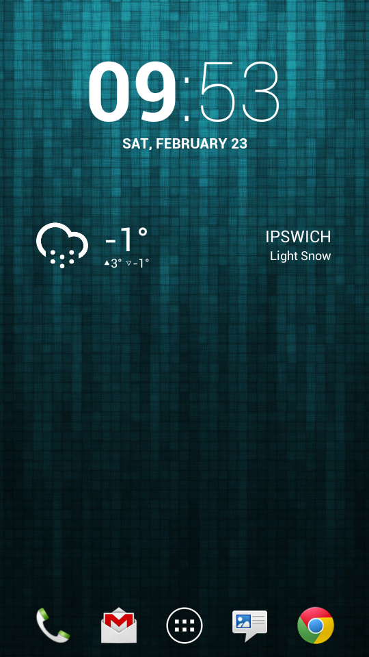
23 Feb 2013 at 10:34 #4,362 NorthstaNder NorthstaNder Soldato Joined 25 Nov 2006 Posts 2,686 Location Ipswich, Suffolk My latest... Still on Nova Prime with a hidden notification bar. A quick double tap drops down the notifications. Icons set at 80% size on a 6x4 grid.
My latest... Still on Nova Prime with a hidden notification bar. A quick double tap drops down the notifications. Icons set at 80% size on a 6x4 grid.
23 Feb 2013 at 19:15 #4,364 m4rk84 m4rk84 Soldato Joined 15 Jan 2010 Posts 2,911 Really like that one Hartgeh.
23 Feb 2013 at 23:41 #4,365 Pc-Gamer12 Pc-Gamer12 Associate Joined 10 Dec 2012 Posts 682 Check out this guys video ! I think his theme looks pretty awesome http://m.youtube.com/watch?v=BUwpoDmvUe8&feature=relmfu
Check out this guys video ! I think his theme looks pretty awesome http://m.youtube.com/watch?v=BUwpoDmvUe8&feature=relmfu
24 Feb 2013 at 00:44 #4,366 Nexus18 Nexus18 Caporegime Joined 4 Jun 2009 Posts 31,823 Small changes i.e. wallpaper and clock widget Last edited: 24 Feb 2013
24 Feb 2013 at 09:12 #4,367 Malicious Malicious Associate Joined 29 Jul 2004 Posts 315 Location Worcester, UK toasteh said: malicious, what clock are you using? Click to expand... it's Clock JB
24 Feb 2013 at 17:11 #4,368 Frozennova Frozennova Man of Honour Joined 13 Nov 2009 Posts 11,617 Location Northampton Bit of change for me too:
24 Feb 2013 at 20:15 #4,369 Caseh Caseh Soldato Joined 10 Sep 2007 Posts 5,393 Location Sheffield Nothing special, but I quite like it.
27 Feb 2013 at 16:54 #4,370 Dirk Dirk Associate Joined 20 Dec 2005 Posts 1,932 So i did some decorating! Repainted the wall and tore up the carpet in favour of some wooden flooring: Not sure if i should redo the text icons in black rather than white now. They would stand out better. What do you guys think?
So i did some decorating! Repainted the wall and tore up the carpet in favour of some wooden flooring: Not sure if i should redo the text icons in black rather than white now. They would stand out better. What do you guys think?
1 Mar 2013 at 08:21 #4,371 Simian Simian Soldato Joined 19 Oct 2002 Posts 8,075 Location Swindoniantown New Wallpaper... Nexus 4 Nexus 7 Must get round to watching Apollo 18 some time soon!!
1 Mar 2013 at 10:29 #4,372 Matteysan Matteysan Soldato Joined 15 Nov 2004 Posts 5,997 Location Telford Well I said I wasn't changing but dash clock is awesome.
1 Mar 2013 at 10:38 #4,373 Simian Simian Soldato Joined 19 Oct 2002 Posts 8,075 Location Swindoniantown Yep!, either Re-sized Condensed, or Full View on Dashclock is awesome!! much better than the standard clock and weather widgets etc... Nice and slimline!!
Yep!, either Re-sized Condensed, or Full View on Dashclock is awesome!! much better than the standard clock and weather widgets etc... Nice and slimline!!
1 Mar 2013 at 10:49 #4,374 benjo benjo Soldato Joined 4 Sep 2005 Posts 12,792 Location London I know it's not compatible with 4.1, but has anyone tried sideloading it? Then using it as a normal widget or with widgetlocker?
I know it's not compatible with 4.1, but has anyone tried sideloading it? Then using it as a normal widget or with widgetlocker?
1 Mar 2013 at 10:59 #4,375 Matteysan Matteysan Soldato Joined 15 Nov 2004 Posts 5,997 Location Telford Simian said: Yep!, either Re-sized Condensed, or Full View on Dashclock is awesome!! much better than the standard clock and weather widgets etc... Nice and slimline!! Click to expand... Indeed! I use the condensed on my home screen & then expanded on the lockscreen looks sweet All these other widgets are pretty meh!
Simian said: Yep!, either Re-sized Condensed, or Full View on Dashclock is awesome!! much better than the standard clock and weather widgets etc... Nice and slimline!! Click to expand... Indeed! I use the condensed on my home screen & then expanded on the lockscreen looks sweet All these other widgets are pretty meh!
1 Mar 2013 at 11:16 #4,376 Simian Simian Soldato Joined 19 Oct 2002 Posts 8,075 Location Swindoniantown Mattey1 said: Indeed! I use the condensed on my home screen & then expanded on the lockscreen looks sweet All these other widgets are pretty meh! Click to expand...
Mattey1 said: Indeed! I use the condensed on my home screen & then expanded on the lockscreen looks sweet All these other widgets are pretty meh! Click to expand...
1 Mar 2013 at 17:27 #4,377 photoshop photoshop Soldato Joined 7 Nov 2006 Posts 5,677 Location Stockton on Tees Darkness
1 Mar 2013 at 18:08 #4,378 Nexus18 Nexus18 Caporegime Joined 4 Jun 2009 Posts 31,823 wallpaper please
1 Mar 2013 at 18:47 #4,379 twist3d0n3 twist3d0n3 Soldato Joined 3 Aug 2008 Posts 10,477 Location Bath, England lol nexus
1 Mar 2013 at 18:51 #4,380 photoshop photoshop Soldato Joined 7 Nov 2006 Posts 5,677 Location Stockton on Tees Wallpaper http://db.tt/o9IByZ5S