You are using an out of date browser. It may not display this or other websites correctly.
You should upgrade or use an alternative browser.
You should upgrade or use an alternative browser.
Website Visual Refresh (Report Bugs Here)
- Thread starter fiveub
- Start date
More options
Thread starter's postsGoing to get shot down for this but it concerns me as to how many issues there are within the core of this site... From a company with over £2m in the bank last annual return and this site being the main income stream you'd expect a tight QC on a final release. Surely there can't be that many pages to check? Most of them fall under templates in which the variables are dropped in? 

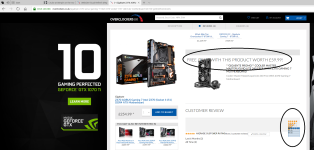
So I think the overall consensus is, great design and lovely refresh! But a number of basic bugs, formatting and alignment issues, crazy spacing and random German text not updated...
Which in all seriousness for a professional outfit like OcUK, you should have proper QA, bug testing and sign off procedures internally before release. So far it seems like the last web redesign, release it as it is, then just ask the public to point out the apprentices' basic balls ups.
Btw guys I do mean this in the nicest way! OcUK is a great company, we have an awesome community here that are happy to help and point out any issues. But the apprentice designer needs to stop releasing stuff without testing it properly. It makes the company look very amateur IMO.
Please don't let this detract from a lovely design I think it's great - just number of basic things should be ironed out for such a big company before public release.
Just my 2p for what it's worth.
Which in all seriousness for a professional outfit like OcUK, you should have proper QA, bug testing and sign off procedures internally before release. So far it seems like the last web redesign, release it as it is, then just ask the public to point out the apprentices' basic balls ups.

Btw guys I do mean this in the nicest way! OcUK is a great company, we have an awesome community here that are happy to help and point out any issues. But the apprentice designer needs to stop releasing stuff without testing it properly. It makes the company look very amateur IMO.

Please don't let this detract from a lovely design I think it's great - just number of basic things should be ironed out for such a big company before public release.
Just my 2p for what it's worth.
I have used OCUK for years as the website was great, and I agree a redesign was needed BUT.....
What happened to the filters on a search? So say if I search for "Noctua", how come I cannot not filter/list by Name/Price/Date etc? It makes it harder to actually find the product I want!
Also how come I need to now scroll to the bottom of the page to go to the next?
What happened to the filters on a search? So say if I search for "Noctua", how come I cannot not filter/list by Name/Price/Date etc? It makes it harder to actually find the product I want!
Also how come I need to now scroll to the bottom of the page to go to the next?
Soldato
- Joined
- 11 Mar 2013
- Posts
- 5,631
Like it better then the old one. The options are much easier to see.
Soldato
- Joined
- 27 Dec 2009
- Posts
- 2,727
- Location
- Gillingham, Kent
Might be being blind, but can't find the "Today Only" offer on the mobile site. Where should I be looking?
Might be being blind, but can't find the "Today Only" offer on the mobile site. Where should I be looking?
If I recall correctly from yesterday, go to Deals then click the banner that days Today Only. URL is https://www.overclockers.co.uk/this-week-only.
In my opinion, using a widescreen display, half the bloomin area is covered by the adverts on the side 
Surely in this day and age, sites should be more dynamic in how they present content as in are relative to browser window size.

Surely in this day and age, sites should be more dynamic in how they present content as in are relative to browser window size.
The OCUK website used to do that however in November 2012 they locked it to fit on low res screens and added the adverts to take up the extra space on high res screens. There were a lot of complaints at the time that quickly got deleted lol.In my opinion, using a widescreen display, half the bloomin area is covered by the adverts on the side
Surely in this day and age, sites should be more dynamic in how they present content as in are relative to browser window size.
Soldato
- Joined
- 27 Dec 2009
- Posts
- 2,727
- Location
- Gillingham, Kent
If I recall correctly from yesterday, go to Deals then click the banner that days Today Only. URL is https://www.overclockers.co.uk/this-week-only.
Thanks for the reply, but still doesn't show me the "Today Only" offer, just shows me the "This Week Only" offers. Currently the only way I can tell the Cryorig C1 is on offer today from the mobile site is to select to change to the desktop version - which obviously isn't then the easiest to navigate on my little Galaxy's screen!

Associate
- Joined
- 8 Oct 2008
- Posts
- 1,313

Text is overlayed ontop of it'self in various places of the site such as the water cooling config.
Looks smarter

Soldato
- Joined
- 8 Sep 2003
- Posts
- 23,239
- Location
- Was 150 yds from OCUK - now 0.5 mile; they moved
you know the caskeing group owns Noblechairs, this is why they push the brand so much, it is logical for them to do so.Welcome to Noble Chairs United Kingdom website...
Oh wait, whats this.. oh, computer components too
you know the caskeing group owns Noblechairs, this is why they push the brand so much, it is logical for them to do so.
Welcome to Noble Chairs United Kingdom website...
Oh wait, whats this.. oh, computer components too
Yes they own it but pushing it so much, actually detracts from anything good they get out of it. Starts to annoy people. Also they do DFS sales tactics, increase the price of the chairs for a legally allowed time limit then reduce the chairs back to the price they were a few weeks prior, then claim a "MASSIVE reduction/Sale" etc
I actually bought a chair from them last year(post brexit) and I saw it on last weeks deal of the week, reduced to the price I paid for it last year, hardly a saving.


