

I agree, it'd look cleaner without the white tables.Excellent, also the sharp thin black and white lines around everything looks like a rather old website and is difficult on the eyes, I would highly recommend a shadow or a colour much closer to a light blue.
such as the following:
Also the black in the reply background of threads is quite harsh and edit feels a bit broken.
You are using an out of date browser. It may not display this or other websites correctly.
You should upgrade or use an alternative browser.
You should upgrade or use an alternative browser.
New forum! Post bugs & errors in here *CHECK FIRST POST FOR ISSUES FIRST - P.S. THE MM IS OPEN*
- Thread starter Feek
- Start date
- Status
- Not open for further replies.
More options
Thread starter's posts

Suppose I'll have to consider re-doing all of my Stylish themes now, not sure I can be bothered though. It's seriously harsh on the eyes and looks incredibly dated, how you managed that with decent software like xenforo is beyond me.
i think that's a user thing - some sort of either weird keyboard settings or a copy and paste error;

I can view other topics with speech marks and create them
We need the option. Old layout and new one if people insist on trying or using it. Can't believe what's happened. Furious.
There is no old layout, the forum has been upgraded which includes moving to a different forum provider.
You can view the desktop version on mobiles using the button as explained by Matt. But we'll look into improvements on the mobile theme
I HATE THIS NEW FORUM LAYOUT. HATE HATE HATE.
Can you give examples of what you don't like please.
Can you give examples of what you don't like please.We need the option. Old layout and new one if people insist on trying or using it. Can't believe what's happened. Furious.
Soldato
- Joined
- 25 Apr 2010
- Posts
- 5,308
- Location
- Ipswich
It looks so god damn ugly! Very unpleasing eyes.
Try changing it so its set to all on again and make sure you hit the save button. There's no way to disable your own avatar, the two are currently tied together.Show user signatures and avatars is set to off, same as before
And I now have neither again. Yay!
Preferred the look of the old forum much more unfortunately. Love the new features and overall would keep the new version if I had to choose, but wish they kept it looking more the old one.
Oh and my sig has changed to one I had a few days ago.
Oh and my sig has changed to one I had a few days ago.
i think that's a user thing - some sort of either weird keyboard settings or a copy and paste error;
I can view other topics with speech marks and create them
You can create them, I think this affects old imported threads only.
there is also this ugliness:
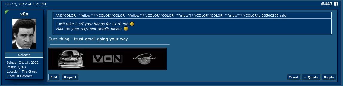
quoted user name is ANDARIAL -
obviously something is starring out A R I A L as yellow swear word?
The [ YouTube ] tags aren't working in Safari on iOS 10. Dunno about desktop browsers.
Is this working for you now?
Preferred the look of the old forum much more unfortunately. Love the new features and overall would keep the new version if I had to choose, but wish they kept it looking more the old one.
Oh and my sig has changed to one I had a few days ago.
Would have been part of the data which was cut over from the old forum - you might have to re-create it I'm afraid

DamnWould have been part of the data which was cut over from the old forum - you might have to re-create it I'm afraid
I can view previously created ones which are fine, like the one I linked you too in previous response. I can only find one example (haven't had time to check everything though!), which is why i suggested some sort of weird user formatting or copy and pasting.You can create them, I think this affects old imported threads only.
there is also this ugliness:
quoted user name is AND****L -
obviously something is starring out A R I A L as yellow swear word?
Damn
Obviously any pictures for your signature you've used will be hosted on the sites - we won't change this. If its text it'll have to be recreated I'm afraid
not sure when the backup was restored - it'll be in different points - topics and posts are up to date which is the main thing!
What I don't like about it this new layout. Everything about the old one was fine. New one everything is too bold and too big. Resize the layout so it resembles the compact nature of the one I've been using for years. I love new things, but this layout is not an improvement at all. I just can't get around nowhere near as fast and I'm very very adaptable to new designs. This new layout is hard work. Need a poll. I'm convinced the vast majority will not approve and beg for the old style which worked brilliantly.
Weird - the screenshot auto formatted - there's nothing I have done. To me your first post is also a bit of a jumble.Btw, I don't see yellow starred swear word as you do in your screenshot, for me it still splits them into BBcode just like in my screenshot
It's been raised dude and will be looked at
")
What I don't like about it this new layout. Everything about the old one was fine. New one everything is too bold and too big. Resize the layout so it resembles the compact nature of the one I've been using for years. I love new things, but this layout is not an improvement at all. I just can't get around nowhere near as fast and I'm very very adaptable to new designs. This new layout is hard work. Need a poll. I'm convinced the vast majority will not approve and beg for the old style which worked brilliantly.
unfortunately, unless there's massive forum breaking issues, we won't be going back to the old design, it was running on some seriously dated software and was due a much needed upgrade.
- Status
- Not open for further replies.