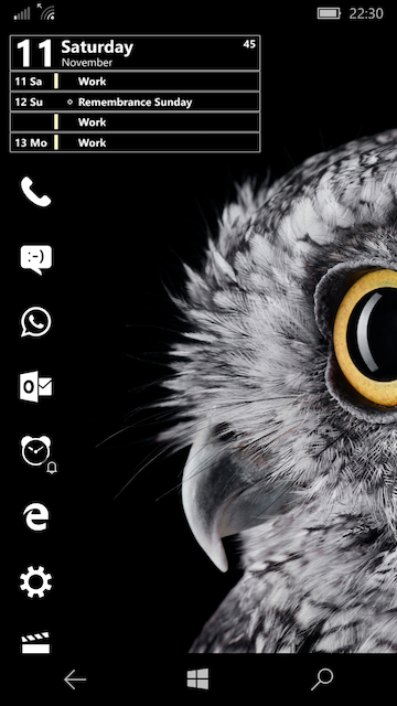
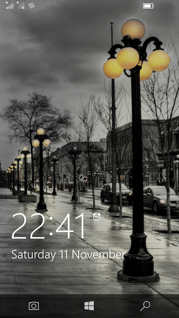
Post your mobile phone desktop!

Currently this but will probably change it once I find a nicer clock. I want rid of the time on notification bar but need to root phone first.

Iclwnai.png
 
On a side note, I can't seem to do much with the navigation bar. On the homescreen here it's basically invisible because there's no shade and the buttons themselves are white. While I have apps open though, it's a bright white background with dark buttons (I want the opposite). Does anyone know how to customise this, either with Nova or TouchWiz settings? The latter allows you to change the background hue to other faint colours but that doesn't help me.
 
Sure it comes up shaded then, but it's over the top of my dock, so looks silly. Also if I swipe up from the bottom that triggers the swipe function on all of my dock icons so opens those instead. Being pedantic I know, but then aren't we all here.
 
Have the navbar set to autohide when apps are open, there's no need at all to have the navbar always showing. This also bypasses false activations of icon swipe gestures on the homescreen. If you just want to return home, then you can hard press the home button area to activate it since the home button is built into the display itself. You can also press home button then swipe left or right to switch apps or go back.

The navbar being over the dock icons is a non issue, since it's only on show for a few seconds and once you click a button or whatever, it hides again. At least this way there is a choice, Pixel owners have no such choice, they are stuck with the navbar always on show.

The alternative is not to have such a bright wallpaper really. Dark shades always look better on AMOLED
 
But that literally only hides the navbar on the home screen, and to me the annoyance of having to flick up to get it is worse than the annoyance of it being there but not being able to see it. I guess in the latter case I'll just get used to using it even though it's barely visible.

The two things I want are for the buttons to be visible on a v.light background, and for the navbar to not be bloody bright when in an app. For instance when I have relay open on dark theme at night, the whole screen is nice and dark except the navbar which is dazzling white. Is there any way to change that?
 
No if you tap the little dot on the left of the navbar in any app, it auto hides it and that is system wide, which stops homescreen icons from false swipes.

The only other option is an app called Navbar Apps, which allows you to customise the navbar. This uses Accessibility Services to monitor and run, so has a small performance impact.

Trade-offs and all that.

Swiping up to show it when you want to switch app or go back is no issue, it's just a single swipe and also means you make better use of the display area instead of it being used by the navbar needlessly.
 
I'm liking the stock S8 look at the minute, simplicity and no faff and I haven't really seen any need yet to change to a launcher to change the icons or stick any widgets on. Probably because I'm a simpleton with just changing over from iOS. :)

0K4YEBy.png

*Swiping left on the lockscreen replaces the music controls with the clock, or vice versa.
 
Last edited:
Back
Top Bottom