Caporegime
- Joined
- 9 Mar 2006
- Posts
- 59,920
- Location
- Surrey
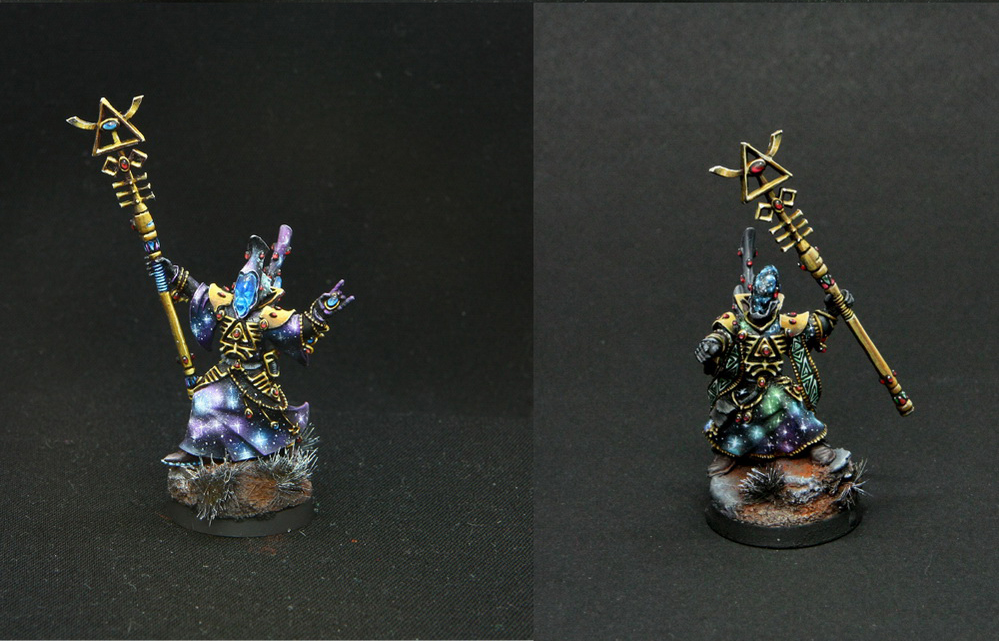
Shamikebab is possibly the best painter here, or at least active, so I'd wait for him to say anything before you buy anything but I tend to paint, and the GW guy in the local shop advised, to have 3 colours for each colour you want to paint. A base, a highlight and an extra highlight. With that you can do your 3 colours or go up to 5 quite easily (mix between).
I'd go blue 4 as your base coat, mix blue 3 with blue 4, then blue 3 for highlights. Maybe Marine 2 for highlights.
As for golds, this company is releasing their golds in a months time or so .. but you could Games Workshop for them, so base in Bathasar gold, shade with Agrax Earth Shade, Highlight with Ghennas Gold then final highlight with auric armour. Could even then go for runefang steel after that.
I'm flattered but that is definitely not true

I generally don't like giving advice on specific colours, I find it is much better just to experiment and find out what works. The 'GW way' is to use a base tone, shade with a wash then layer on highlights. This is because they can sell 3/4 paints for each bit of model you paint. It's far from the only way to paint though. The danger in picking a dark, mid and light colour for an area is that the tone of the three colours does not match so you end up with an unbelievable scheme.
If I wanted to replicate that paintjob using the War Colour paints (which I've not tried myself yet but have heard good things) I would base the mini with Blue 5. Use Blue 5 with a little black and a dark red to deepen the shadows (a little red mixed into the blue will give much richer and more believable shadows) Then edge highlight with the base mixed with increasing amounts of white.
For golds I really recommend the Scale 75 metallic sets, they're excellent quality. I do use a few GW metallics on occasion, Balthasar Gold is a really nice base colour for gold. I've not used Auric Gold (I still have a pot of the last range to go through) but you could use that to highlight. Purple or red (or both) glazes into the shadows will help increase the contrast and tie it in with the shadows of the blue.
") .
.