*** The Official OS X Mountain Lion 10.8 Thread ***

Running ML on an i7 2.2 with 16GB RAM + 500GB 7200rpm HD for a few days.

It's slow when it starts but speeds up over time. I would say it's a little more bloated as I've noted a larger regular footprint. I would say 8GB should be used - especially if you use VMs.

Parallels are charging £65 for Parallels 7 as earlier versions don't work and there's no option to upgrade as the app for P6 is unsupported by 10.8. So that 13.99 costs £78.89 in reality.
 
How about after you have logged in? Like opening apps and hd movies etc?

No problems so far. Everything has been very quick. I'm actually very impressed with the speed. Nothing has beach balled / colour wheeled yet either. And I'm using a mechanical HDD.

I do have 8GB of RAM as mentioned though. But honestly I can't see that being a major problem unless you're trying to open a lot of stuff simultaneously.
 
ok thanks for the answers, looks like i'll need to upgrade to 8gb ram then.

Wheres the best/cheapest place to go to get it?

I have just been looking at Crucial and they do a 8gb kit for £38. Is that good?
 
I've run with Crucial memory upgrades since 2008, never had an issue.

Just a warning - OcUK do upgrades too (including Crucial) so careful discussing competitor prices.
 
No idea how thats possible. Even when I had my Dell 2405 hooked up, the font rendering was exactly the same as an Apple display as it is right now and even the Tiger days when I first started using it.

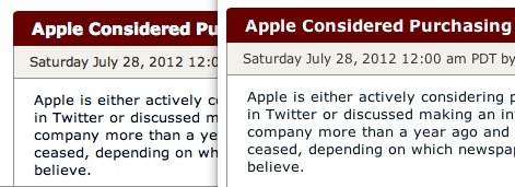
Which of the two do think is a correct display of a font on a page designed specifically for mac community?:
fontsm1.jpg

This one.

With all due respect I've been using Macs for 7+ years and support them for a living. I'm using both my home Macs connected to a Dell IPS monitor and there's no difference between that and an Apple display. The font rendering you think is incorrect is the standard rendering from OS X 10.4 Tiger onwards. I can't comment on earlier versions.

EDIT : trawled through my old posts and found this link : http://www.joelonsoftware.com/items/2007/06/12.html from here http://forums.overclockers.co.uk/showthread.php?t=17767705
 
Last edited:
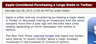
I honestly can't believe any of you would want to argue that the fat, fuzzy, runny text in the headline of the "Apple Considered Purchasing" headline is how any commercial OS developer, let alone one like Apple, that spends so much effort improving display resolutions and jaggedy edges for years, intended SMOOTH fonts to look like this. Especially when you can see OSX is perfectly capable of displaying good looking, crisp and easy to read smoothed fonts in example to the right

fontsm6.jpg


I find it hard to believe anyone would spend 7 years since 2005 browsing pages that look like a bad printout from Lexmark inkjet onto a toilet paper and think it's normal and not try to fix them. Why wouldn't you? :D

Left to right: What you say is font "smoothing" in OSX, what I say is font smoothing in OSX, what Windows believe is smoothing, what a page without font smoothing with CRT setting actually looks like

fontsm7.jpg


The "Smoothing" you consider normal would totally kill my workflow, I wouldn't survive a day if my terminal was all fluffy and unreadable like the one to the right:
fontsm9.jpg
 
Last edited:
I agree with v0n text is (especially on this forum) noticeably bolder. I'll reinstall VM Ware later and boot into my Lion VM to compare on dual monitors.
 
Why doesn't my own image show up in Messages? I have a picture attached to my contact card in address book and I get pictures for everyone else but my own one doesn't show.

open messages click on messages top left then change photo, wondered this last night :)

unless you sorted it out already :p
 
Last edited:
That is REALLY uncomfortable to read.

I disagree, Lion is far more readable. Having bold text everywhere is a bit wtf.
Your fontfaces look incorrect.

The font's aren't incorrect, MR is serving different stylesheets for the byline. Possibly AB testing. Or maybe a cached version. But on my Lion VM they're serving Georgia in italic and on ML I'm getting Verdana.
 
Last edited:
Are you looking at it on a laptop with less than 1080 resolution out of curiosity?

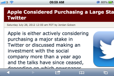
I am. Reading this thread at the moment on my iPhone 4S and the top JPG is still a little too faint for my liking. The boldness, especially on these forums, helps the text stand out from the background and requires less focus to read.
 
I honestly can't believe any of you would want to argue that the fat, fuzzy, runny text in the headline of the "Apple Considered Purchasing" headline is how any commercial OS developer, let alone one like Apple, that spends so much effort improving display resolutions and jaggedy edges for years, intended SMOOTH fonts to look like this.

<snip>

You can paste screenshots till kingdom come and I'm not going to change my opinion. As much as I'm tempted to install every OS from 10.5-10.8 on my Mac mini just to post some proof that will keep the discussion going for another 24 hours, I've frankly got better things to be doing.
 
You can paste screenshots till kingdom come and I'm not going to change my opinion. As much as I'm tempted to install every OS from 10.5-10.8 on my Mac mini just to post some proof that will keep the discussion going for another 24 hours, I've frankly got better things to be doing.

I still reckon his colour profile is messed up. It's messing with the colours and possibly the rendering... or maybe not necessarily messed up, just doesn't work well with OS X.

When I had a dodgy icc on Windows, lots of weird and strange things happened it took me a fair bit of troubleshooting on the Firefox forums to get it sorted. It wasn't until others pointed out to me my colour profiles and eventually seeing it across several displays.

Once I bought a hardware calibrator, everything was cured.
 
Back
Top Bottom