Pete/Worzel will be shaking in his boots if you get your 325 improved, that hornet of his won't keep you off the top of the scoreboard in our coop matches lol
lol....
The 325A is a good ship, but. Worzel was Flying the Hornet stock, if he sticks a N4-160f Turret on the nose with a couple of repeaters no one will get anywere near him on the scoreboard.
And if he adds the Flashfire Specialty Mount and a couple more cannons it effectively becomes a Super Hornet, not one of us will even get a look-in.
The Hornet is awesome with just the N4-160f Turret, personally i don't like to use the Hornet setup
too aggressively in CooP, like with the Flashfire Specialty Mount, altho i have never tried it i just know its too powerful for a friendly CooP.
As for the 325A, in handling characteristics i'm happy with it where it is, its just right for where it is, its really good and if it was any better it would match the Gladius.
Weapon / Defence configs are also just right.
Nose Mount: S2 Gimballed or S3 Fixed
Wings x2: S1 Gimballed or S2 Fixed
Missiles x2: S3
Shields: S3
Power: S3
The only changes i want are structural and cosmetic, and some fixes.
There are 4 ships in the 300 Series range, the 325A is the fighter of the bunch, therefore IMO it should be set apart from the other 3 in its amour, in-that 'it needs some' it has none, its as flimsy as the Mustang Omega, it cannot take any hits once the shields are breached, it falls to pieces after a few hits, it survives for seconds.
It doesn't need to be like the Hornet, but even the Aurora LN has some durability, it can take hits with the shields down, not as many as the Hornet but far more than the 300 series. i think its fair to make the 325A and perhaps also the 315P just as durable as the Aurora LN.
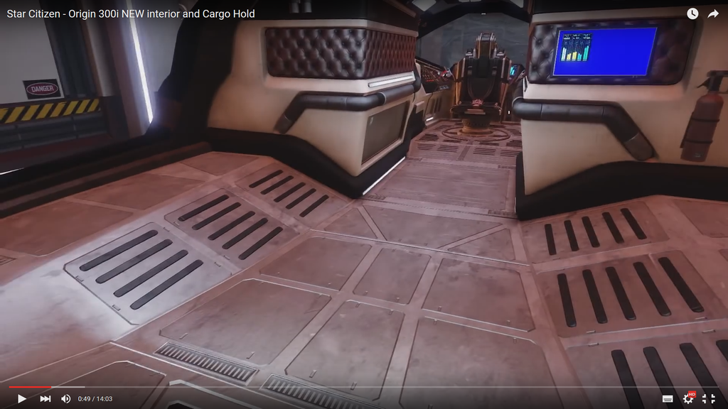
Cosmetics, the interior is nice but i think it needs updating, right now it looks like the inside of one of the old 5 series BMW's, one from the late 80's to early 90's, E34 i think? it needs to look more like a 2014 onwards 5 series BMW.
The cabin is also very dark, it needs lights that illuminate the interior. maybe some fancy colour mood lighting LED Strips n' stuff.
The exterior design is fine, sexy, although IMO the landing gear is too tall, makes it look gangly. hunkered down more would give it a more aggressive stance sitting on the pad, Like the Gladius.
Exterior textures are like place holders, very low res, they look like 0.5K, they need to be 1K preferably 2K, i think later ships like the Gladius and Constellation are at least 1K, they also need Hight and Bump mapping to give it 'A Texture' and some dimension.
Upgrading Shields needs fixing, right now you can't, the ladder does not retract so it sticks out the side of the ship when you fly about.
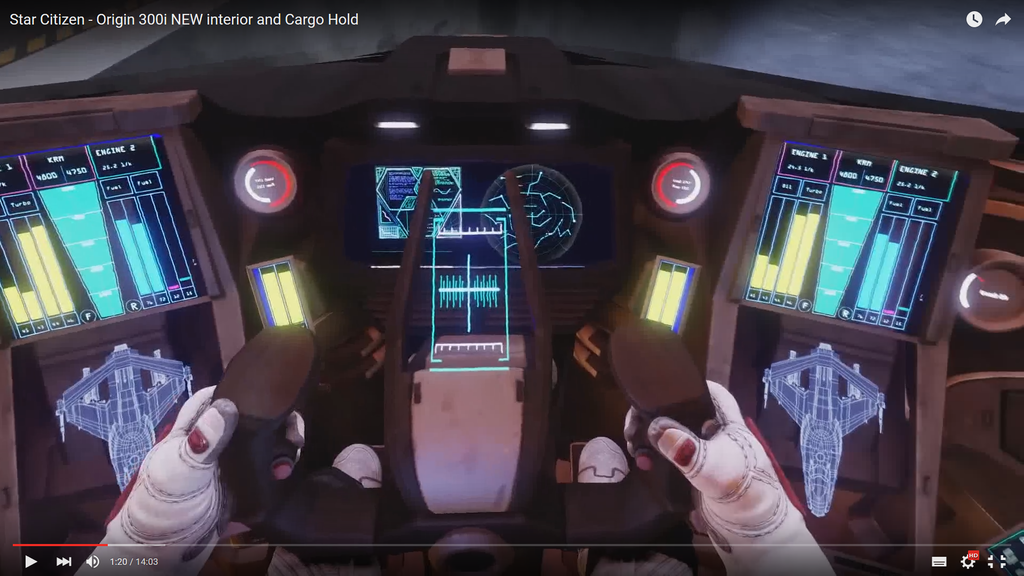
This is more along the lines of what the 300 series should look like inside.
Bight and luxurious.


 Thanks for the heads up!


