World first QD-OLED monitor from Dell and Samsung (34 inch Ultrawide 175hz)

What they really needed to do was make a format that provides HDR as a superset of SDR signals without needing the display to switch mode.

That's what HLG is. The broadcasters use this because it allows the HDR to be easily 'stripped' or 'omitted' if the receiving equipment/display can't support it.
 
Yep, back to waiting in the unknown.

Shame, with those going out this time last week I thought it was going to be a weekly batch thing.
 
Makes me laugh this fiasco as I specifically said this to dell as a reason to just let me keep my first one and drop the price to £847 so that I could cancel said second order given the chances of it being delayed again..... But nope, had to be awkward. Definitely will be giving a poor rating once they close the case for my return.

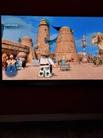
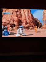
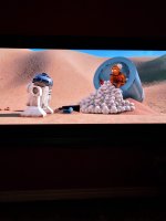
Either way, not really that bothered as completed the main games on the monitor I wanted to and will be coming into the better weather now so not in much of a rush. Currently playing the new lego star wars on my 55" oled as this is the perfect game for lying back and chilling with controller in front of the bigger screen. One to check out for you lot:

SdVhV3A.jpg

GgCMwor.jpg

HOI6big.jpg


@srekal34 did you get any further along with the warranty status?
 
Looks like people have now uploaded a spectral profile for this monitor on the DisplayCAL database so I gave calibration a go.

Strangely I was not liking the results. Something just seemed a bit off, too much vibrancy.

So I uninstalled and installed ccProfiler from X-Rite/Calibrite who make the i1Display Pro. Same results again.

I think what it is, is that you have to adjust the RGB values, which means you have to flick to Custom mode. Outside of the Creator mode (sRGB Gamma 2.4 setting), colours just seem too punchy, even after the calibrated icc profile is set. I also noticed that there is a visual difference between Windows Photo Viewer (old skool), Photos (Windows 11 photo viewer), the same image loaded in a browser tab and the same image RAW file (processed) loaded in Lightroom. Lightroom, Win Photo Viewer old skool looked neutral and natural just how I expected it to look as that's how I edited it on the LG IPS before.

But on the others the colours were punchy again, it's subtle but they are definitely higher in reds especially as skin tones look more vibrant than they should.

I uninstalled all calibration software and reverted back to no icc profile applied in Winodws:
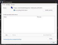
egcbs0N.jpg

And made sure the system default profile remained as the sRGB one:
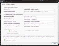
cI8lWb1.jpg

This is now how I mentioned from before and what I mentioned in my review. With the above no matter what app I load the same photo in, they all display the photo exactly the same, a nice skin tone and looks exactly how I colour graded it in Lightroom on the old LG IPS.

I don't know what it is but anything but Creator mode set to sRGB seems "wrong" to my eyes.

So I guess for now at elast, I will leave it on Creator, sRGB and gamma 2.4 as that feels the most natural to me based on how my own photos look.

Or maybe it's that I'm too used to a monitor with an internal LUT which results in a calibration that is more accurate and this is pretty much what Creator mode in sRGB is replicating as far as I can see.
 
Hmm I thought that's what the correction profile was supposed to get around?

Oled calibration is a different field it seems then. Luckily the creator mode is visually accurate enough for it to not be a bother to me I guess now.
 
Thanks to a comment on reddit it looks like Better ClearType Tuner sorts out the remaining text fringe issue that some may notice more than others as this does appear to vary between panels and base ClearType adjustments.

https://github.com/bp2008/BetterClearTypeTuner
I set it to RGB and a contrast of 2200 which seems to have almost eliminated fringe when I bring my eye right up to the monitor, or at least to my eye anyway, you can still see a minor amount if you use the screen magnifier at 200%

Thanks for the info and link Rob, will be trying this!
 
Thanks to a comment on reddit it looks like Better ClearType Tuner sorts out the remaining text fringe issue that some may notice more than others as this does appear to vary between panels and base ClearType adjustments.

https://github.com/bp2008/BetterClearTypeTuner
I set it to RGB and a contrast of 2200 which seems to have almost eliminated fringe when I bring my eye right up to the monitor, or at least to my eye anyway, you can still see a minor amount if you use the screen magnifier at 200%
Good stuff. Set mine to the same. Looks good.

I think I am getting used to it all now. As in the text and resolution change. Been messing around with wallpapers. Converted a bunch of my 4K ones successfully using GIMP and they came out surprisingly well. Grabbed some new ones also, though not easy doing this as I am rather fussy. Got around 25 now which should keep me happy for years :D
 
Same

Thank you for your recent order with Dell. We are working to ship your order as quickly as possible. Unfortunately, the delivery date for your order to arrive has been updated to 06/05/2022.

Your order is very important to us. We apologize for any inconvenience this change in delivery may cause.

For the most up to date information, please use the button below to track your order or initiate a cancellation request and avoid any charges.

We appreciate your business and patience. Thank you for choosing Dell.
 
Got the same email. Not been impressed with their system really. Feels like these dates are just pulled out of thin air really.
 
Back
Top Bottom